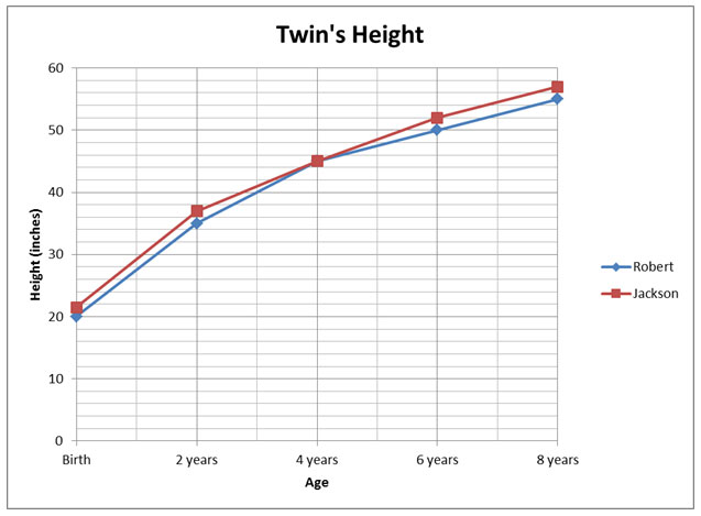
Use the graph to answer the question below.
Which of the following is the best estimate of Robert's height at age 5?
A. 50 inches
Incorrect. That was Robert’s height at age 6.
B. 48.2 inches
Incorrect. That was Jackson’s height at age 5.
C. 52 inches
Incorrect. That was Jackson’s height at age 6.
D. 47.8 inches
Correct!
What trends are displayed in the graph below?
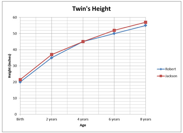
A. The twins weights are relatively close to each other each year. However, Jackson weighed slightly more than Robert each year except at age 4 year when they weighed the exact the same amount.
Incorrect. What is the dependent variable that is being displayed in this graph?
B. The twins are the same height and weight.
Incorrect. Look carefully at the graph.
C. The twins heights are relatively close to each other each year. However, Jackson was slightly taller than Robert each year except at age 4 year when they were the exact same height.
Correct! This best describes the relationship shown in the graph.
D. The twins are relatively close in height each year but Robert is slightly taller than Jackson except when they were 4 and they were the exact same height.
Incorrect. Look at the graph carefully. Which color of line represents Jackson and Robert?
Industrial wastes can play a large role in polluting rivers, lakes, and streams. A student takes water samples from a river that passes a factory and tests for pollutants. What is the trend shown in the following data table?
|
Distance from Factory (meters)
|
Amount of Pollutants (ppm)
|
|
0
|
1340
|
|
50
|
950
|
|
100
|
630
|
|
150
|
440
|
|
200
|
310
|
|
250
|
200
|
A. The amount of pollutant increases as you get farther from the factory.
Incorrect. The amount of pollutant is decreasing, not increasing.
B. The amount of pollutant decreases as you get farther from the factory.
Correct! The amount of pollutant is decreasing.
C. The rate of decrease is increasing as you get farther from the factory.
Incorrect. The rate of decrease is decreasing.
D. The rate of increase is increasing as you get farther from the factory.
Incorrect. The amount of pollutant is decreasing, not increasing.
An experiment studies the effects of an experimental drug on the number of offspring a mother mouse has. Ten female mice are given the drug and then impregnated. The number of mice in their litters is compared to the litters of mice that did not take the drug.
Which of the following is the best conclusion based on the data displayed in the graph?
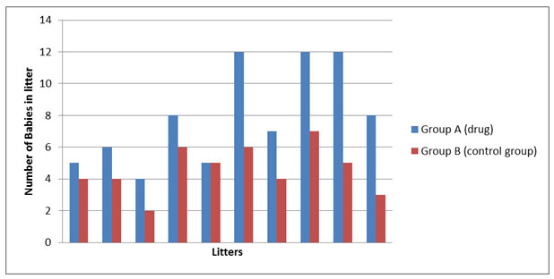
A. The mice given the drug lived longer than the mice not given the drug.
Incorrect. Life span is not taken into account in this experiment.
B. It is better to give the mice the drug.
Incorrect. This is an opinion.
C. The mice given the drug on average produced more babies in each litter than the mice not given the drug.
Correct! This is a valid conclusion based on the data.
D. The drug seems to have no effect on the litter size.
Incorrect. The number of offspring in the litters produced by the mice that received the drug is compared to the number of offspring in the litters produced by the mice that did not receive the drug.
A group of students examined a sample of local pond water. They identified three species of protozoans. They decided to examine the water sample every day for a week. They added food for the protozoans each day and counted the number of each species. Their findings are recorded below.
|
Protozoan Count
|
|||
|
Day
|
Species A
|
Species B
|
Species C
|
|
1
|
25
|
20
|
23
|
|
2
|
50
|
44
|
31
|
|
3
|
85
|
63
|
42
|
|
4
|
102
|
68
|
44
|
|
5
|
140
|
71
|
50
|
|
6
|
180
|
70
|
53
|
|
7
|
192
|
64
|
40
|
A. Species B is the food source for Species C.
Incorrect. Nothing in the data indicates that Species B is eating Species C.
B. The food added the best food source for Species B.
Incorrect. The word BEST makes an answer unlikely.
C. Species C had a shorter life span than Species A.
Incorrect. The life span of the species is not the hypothesis. We are looking at food.
D. Species A was successful in acquiring the food needed to survive.
Correct! Species A population continued to grow, which means they are eating and reproducing.