Several types of graphs show the distribution of a data set.
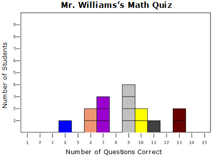
A line plot shows the distribution of a data set by placing a marker on a number line for each data value. The more frequently a data value occurs, the higher the stack of markers.
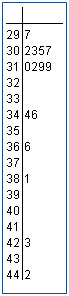
A stem-and-leaf plot places the hundreds and/or tens digit in one column and the ones digit in another column in order to show the spread of a set of data. The stem and leaf plot shown represents the heights, in meters, of the 15 tallest buildings in the United States.

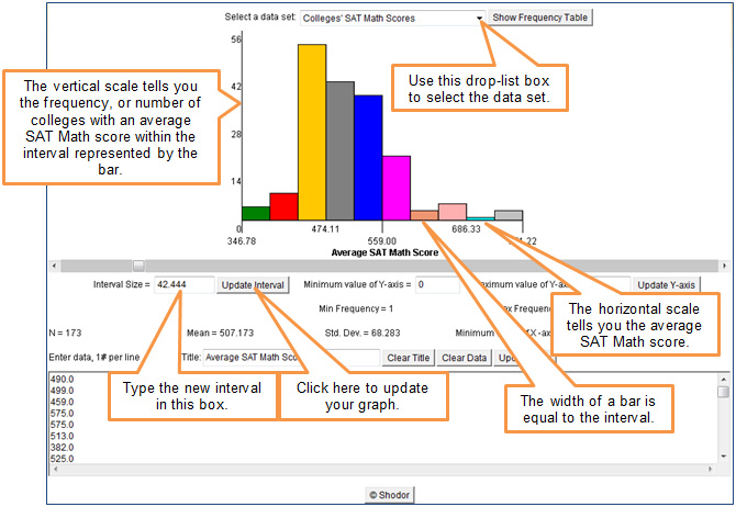
In this part of the resource, you will investigate histograms, which are commonly used to show the distribution of a set of data.
A histogram appears like a bar graph in that data are represented using bars. However, there are some important differences.


Click the image below to open a histogram generator in a new window.
| 40 | 35 | 30 | 25 | 10 | 5 |
| 40 | 50 | 75 | 100 | 200 |
Use your observations to answer the questions beneath the image.
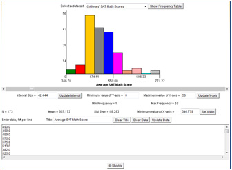

How does the width of each bar change as the interval becomes smaller?
Interactive popup. Assistance may be required. Each bar becomes narrower as the interval becomes smaller.
How does the shape of the graph change as the interval becomes smaller?
Interactive popup. Assistance may be required. If you connected the top of each bar with a smooth curve, what would that curve look like?
Interactive popup. Assistance may be required.
The cluster of tall bars seems to widen and include more bars as the interval becomes smaller.
How does the width of each bar change as the interval becomes larger?
Each bar becomes wider as the interval becomes larger.
How does the shape of the graph change as the interval becomes larger?
Interactive popup. Assistance may be required. If you connected the top of each bar with a smooth curve, what would that curve look like?
The tall bars seem to move toward the left, and the bars on the right of the graph get shorter.
In the context of the data presented in this graph (colleges’ average math SAT scores), what does the shape of the histogram tell you?
Interactive popup. Assistance may be required. Each bar represents the number of colleges with an average math SAT score in that interval.
Interactive popup. Assistance may be required.
Taller bars represent more colleges with an average math SAT score in that interval. Most of the taller bars are to the left of the middle of the graph (about 556), implying that most colleges have a lower than “middle” average math SAT score.
How might an interval be used to create a misleading histogram?
Interactive popup. Assistance may be required. An interval that is too small or too large may create misleading conclusions about the distribution of the data set, leading the reader to believe that higher frequencies of data occur where they may not really be occurring.

How is a histogram different from a bar graph?
Interactive popup. Assistance may be required. A bar graph is used for categorical data, which show the frequency of the number of data points within a category; the horizontal axis will have text labels. A histogram uses intervals to show the frequency of the number of data points within a numerical interval; the horizontal axis will have numerical labels.
How is a histogram different from a line plot? How are they related?
A histogram uses bars that are the same width as an interval to display the distribution of a data set. A line plot uses individual markers to tally the number of times a particular data value occurs in a data set. They both show the distribution of data within a set, including the frequency of repeated values, but a line plot shows each individual value where a histogram focuses on data values within an interval.
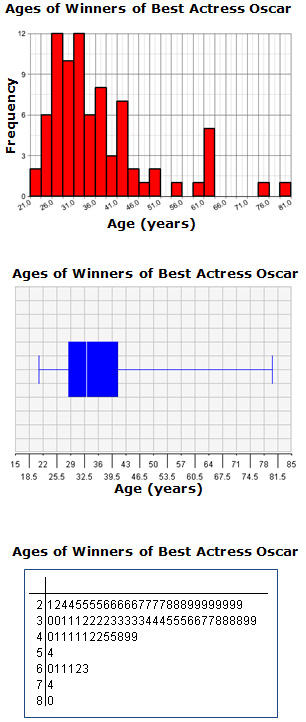
Each of the graphs shown represents the ages of the winners of the Oscar for Best Actress, when they received the award, from 1929 until 2012. For each statement given, identify the graph which best supports the statement.
Interactive popup. Assistance may be required.
The box-and-whiskers plot best reveals
Interactive popup. Assistance may be required.
The stem-and-leaf plot best reveals
Interactive popup. Assistance may be required.
The histogram best reveals this
Interactive popup. Assistance may be required.
This statement is supported by
Interactive popup. Assistance may be required.
The box-and-whiskers plot best reveals