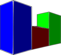
Source: 3D bar graph, Smallman12g, Wikimedia
Authors write texts to present information to their audiences. Sometimes the information is complex. In these cases, the author might choose to organize the information in graphic forms such as graphs, charts, and diagrams to make the information more understandable. Of course, this only works if the graphic itself is clear. How do we decide if a graphic representation of information is clear? Read the four graphic elements and the guiding questions for each element in the graph below. You can use these elements and questions to evaluate clarity.
| Graphic Element | Guiding Question |
|---|---|
| The title and subtitle of the graphic | Is the title (and possibly a subtitle) in a prominent place in the graphic, and how well does it describe the information presented? |
| The key or legend of the graphic | Is the key or legend in a prominent place in the graphic, and does it provide you with everything you need to interpret the information? |
| The format of the graphic (the way it is set up) | Does the graphic contain vertical, horizontal, or circular scales, and are they presented clearly? |
| The relationships among the data in the graphic | Does the graphic lead you to conclusions based on highs, lows, and trends in the data presented? |
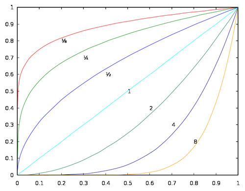
Source: Root graphs, EnEdc, Wikimedia
You will recall that graphs, whether they are line graphs or bar graphs, are arranged to show numbers and facts on an axis. In other words, the vertical axis shows one set of data, while the horizontal axis shows another. Let’s look at a bar graph and evaluate its clarity.
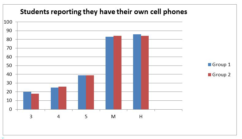
Source: Research Findings: MARC 2011 Survey Grades 3-12, IPSI
If you look closely at the bar graph, you can see that the information presented is a little vague. In a moment, you will read the graph of graphic elements that pertains to the bar graph above. The graphic elements graph now contains answers to the guiding questions. Taken together, the answers help evaluate the graph’s clarity.
Read the guiding questions and then read the answers to see how each element of the bar graph above might be evaluated for clarity. How would the reader know, for example, that the information in the graph comes from one school district? This information should be in the title. How would a reader know that the two bars in each column represent boys and girls, respectively? This information should have been made clear in the key or legend. Also unclear are the meanings of the numbers under the columns: “3” of what?, “4” of what? A reader can’t help but wonder. These figures should be labeled according to what they represent in the graph: Grade 3, Grade 4, and Grade 5.
| Graphic Element | Guiding Question | Answers |
|---|---|---|
| The title and subtitle of the graphic | Is the title (and possibly a subtitle) in a prominent place in the graphic, and how well does it describe the information presented? | Title is in a prominent place, but it’s not clear how many boys and girls are represented. Is this data for a country, a city, one school? There’s no way of knowing. |
| The key or legend of the graphic | Is the key or legend in a prominent place in the graphic, and does it provide you with everything you need to interpret the information? | The legend is missing headings for “boys” and “girls,” without which a reader does not know why there are two bars in each grade. |
| The format of the graphic (the way it is set up) | Does the graphic contain vertical, horizontal, or circular scales, and are they presented clearly? | Vertical axis: The units are not labeled. Are they percentages? Horizontal axis: The horizontal axis is incompletely labeled. Does “3” equal “grade 3”? |
| The relationships among the data in the graphic | Does the graphic lead you to conclusions based on highs, lows, and trends in the data presented? | Relationships among lengths of bars show how close the two sets of data are. |
Using the answers above, here is the same bar graph after corrections for clarity have been made. See if you can answer the questions below about the bar graph now that the information presented is clearer.

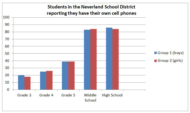
Source: student_cell_phones2, IPSI
- According to the graph, in what grade could you most likely expect to see just as many girls as boys with cell phones?
- Which of the following statements best describes the overall relationship among the data given in the graph?
- The information in the bar graph clearly indicates that cell phone ownership among students doubles once they enter middle school.