Understanding Graphics
A graphic, sometimes called an infographic, is a great way to represent data in a visual way. For example, when the weather reporter on the news shows a picture of Texas with the temperatures for various cities, you’re seeing a graphic. Timelines are also graphics that convey information. Newspapers make great use of graphics in their stories. They grab the reader’s attention and often get readers to read a story they might not have otherwise read. An interview with the New York Times graphics director Steve Duenes revealed that billionaire Bill Gates credited an infographic about third world health problems with causing him to become interested in donating money to fight AIDS in Africa.
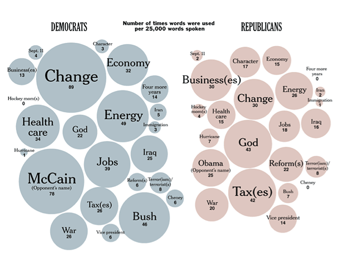
Let’s take a look at the graphic below. Suppose you are writing a paper about the 2008 election and the factors that led the Democrats to victory. You could use the graphic below as a source. This graphic from the New York Times gives a picture of the frequency of words spoken by the candidates in each party. What information can we get from this picture? We can see that the large bubbles represent the words spoken most often by the candidates, and the smaller ones represent the words spoken less often. If the creator of this graphic were to write this data in a paragraph, it would be hard to keep all of the numbers straight while reading it, but in picture form we can see that the Democrats used the words “change” and “McCain” most often, and the Republicans used “God” and “Taxes” most often.

Source: Campaign language, Matthew Ericson, New York Times
The larger bubbles indicate that Democrats used some words much more frequently than others. You'll notice there are more similar sized bubbles on the Republican side indicating that they used more words with equal frequency. Again, this graphic is most useful because it shows a picture of the data that makes it easier to understand.
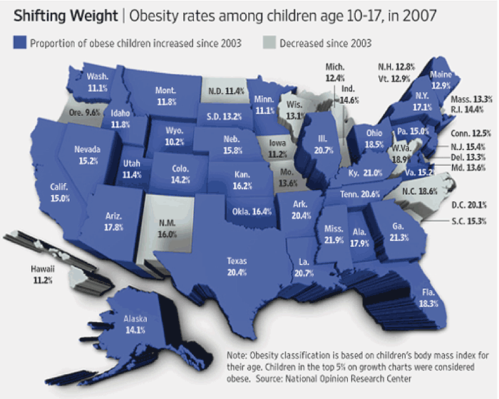
Let’s look at another graphic and see what it tells us. This is a map from the Wall Street Journal. Look over it and then answer the questions below using your notes.

Source: Obesity rates (2007), Wall Street Journal
You can write the answers to the questions below using your notes. Check your understanding when you are finished.
- Has childhood obesity increased or decreased in most states?
- How much has childhood obesity increased in Texas since 2003?
- What years does this map cover?
- It has increased.
- 20.4%
- 2003-2007
You’ll notice that it’s easier to gather big picture data than to gather details from a graphic. However, one graph can’t tell us everything. If you wanted to know which state had the highest increase in obesity, this map wouldn’t be the best source because you would have to look at every dark blue state on the graph to see the percentage increase of each state. Graphics are great when you want to find a general trend such as the increase in childhood obesity across the United States, or when you want to jump-start your research by analyzing a graphic for questions that intrigue you. For example, this map makes me wonder why obesity rates decreased in states like West Virginia and North Carolina.
In the next section, you’ll look at getting information from tables. Although still visual, tables provide more detail than a graphic.