Easy access to relatively sophisticated software has made it easier than ever before to add visual aids to informational texts. Infographics, that is graphics that analyze information, are increasingly common in newspapers, magazines, and blogs. Both funny and thought-provoking infographics “go viral” on the Web daily and circulate the globe in a matter of days or even hours! Infographics are just another way to visually present data.
The infographic on this page explains U.S. oil consumption. Although there is not a great deal of text, you can actually learn quite a bit from this graphic. For example, the average miles per gallon (mpg) for U.S. cars and light trucks is considerably lower than other industrialized nations, yet we drive more miles per year, and most of us who drive to work do so alone.
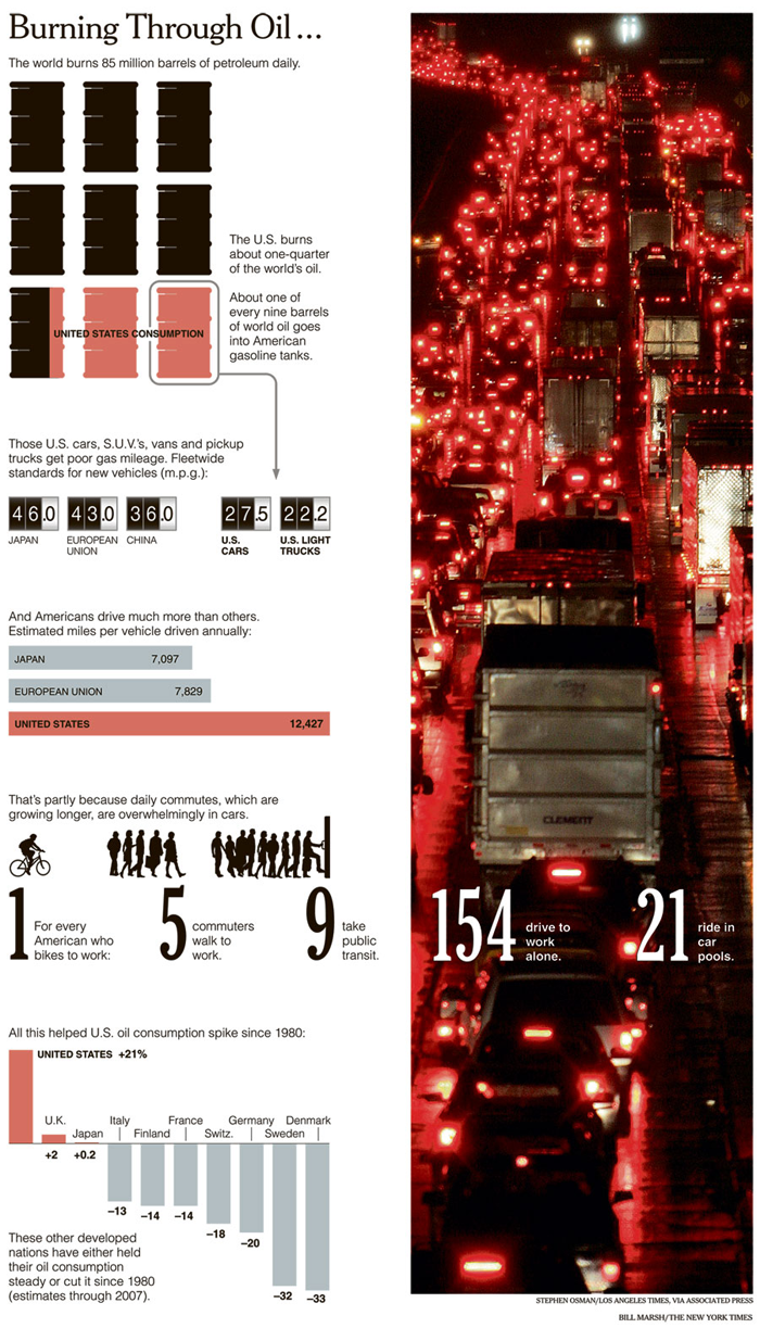
Source: Burning Through Oil . . .; Stephen Osman, Los Angeles Times via AP and Bill Marsh, New York Times; New York Times Knowledge Repository
http://www.nytimes.com/imagepages/2008/04/20/weekinreview/20mouawad-graphic-1.html
For access to a text version of this infographic, click here.
 Using your notes, respond to the following questions about the infographic. When you’re finished, check your understanding to see possible responses.
 - What factors have contributed to the increase in U.S. oil consumption since 1980?
- What might Americans do to consume less oil?
- Why do you think the illustrator or graphic artist included the picture of nighttime traffic in the background of this infographic?
Sample Response:
- Americans drive more and have less efficient cars.
- Take public transportation; manufacture more efficient cars.
- The massive number of red taillights evokes the huge number of cars on American roadways.
Once you understand how to read and interpret the information offered in charts and graphs like the one above, you will probably look for them every time you read informational text that contains data. They help you figure out complex information and data by presenting it in easier-to-understand graphics. The better you are able to interpret charts, graphs, tables, and infographics, the more successful you will be when you use them in your own presentations.