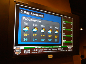
Writers use tables to present statistical data in a way that’s easy to read. If you had to read the numbers and statistics from a table in paragraph form, you might have a hard time keeping the information straight. For example, here’s a five-day weather forecast in paragraph form:

Source: shiz-20120710-600x600, madabandon, Flickr
The weather in our area for the next five days will be as follows: Saturday will be partly cloudy with a high of 49 and a low of 34. Sunday will be partly cloudy with a high of 47 and a low of 37. Monday will be mostly cloudy with a high of 47 and a low of 36. Tuesday will be partly cloudy with a high of 51 and a low of 36. Wednesday will be partly cloudy with a high of 50 and a low of 32.
Now, look at the same information as it is presented in the table graphic below. Yes, the five-day weather forecast is a table! This is the kind of graphic you might see on the local news. It provides a visual comparison of numerical data. By looking at the upcoming weather in this format, you can get an idea about weather trends: It’s going to be partly sunny (or partly cloudy) for the next five days, but temperatures will be slightly warmer during the day on Tuesday and Wednesday.
Source: RippleTV: Weather, gumption, Flickr
Encountering this kind of information in a paragraph might make it more difficult to understand. Trying to understand the forecast by only reading about it in paragraph form could also make it harder to visualize the days when the weather changes, for example, but a picture or table is able to show this information at a glance.
Tables place data into horizontal rows and vertical columns. In the forecast, a day of the week appears at the top of each (“Sat”–“Wed,” in this case). The rows contain the following information: the likelihood of sun or clouds, the high temperature, and the low temperature. The data is presented in a specific order, but a paragraph might not present the data in a consistent order. Suppose the writer described Saturday in this order: likelihood of sun, high temperature, and low temperature. What if the writer then described Tuesday in this order: low temperature, high temperature, and likelihood of sun? This would be more confusing than the table, which presents the data consistently in an easy-to-understand graphic.
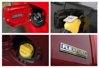
Source: Four US E85 flex fuel labels, Adrian Gable, Wikimedia
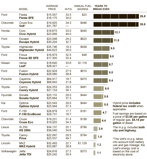
Let’s look at another table. In the last decade, some people have argued for more fuel-efficient vehicles. This is not only because vehicles that use less gas are considered better for the environment but also because rising gas prices make fuel-efficient vehicles better for drivers’ wallets—at least, that’s the assumption. Is it correct? To find out, read the table below and answer the questions that follow.
The table illustrates how long it will take for the amount of money saved on fuel costs to equal the amount of money a buyer saves by buying the standard (not as fuel-efficient ) version of the same car. This is shown as the “break even” point in the chart. After the “break even” point, the fuel-efficient car will be cheaper for the consumer to operate than the standard model of the same car. Note that the vehicles listed in boldface type in the chart are the fuel-efficient models.
Source: New York Times Knowledge Repository,
http://www.nytimes.com/interactive/2012/04/04/business/the-cost-of-higher-fuel-economy.html?ref=energy-environment
For access to a text version of this table, click here.

Now answer a few questions about the information presented in the chart. Click on one box for each question to respond.
1. What is the cost of a gallon of regular gas used in the calculations?
2. Which car will take the longest time to break even?
3. For which car have consumers paid the highest price on average?
4. Which car has the lowest annual fuel savings?
5. Which car will take the least time to break even?
 Continue referring to the table about buying fuel-efficient cars and answer the questions below. Use your notes to write your responses. When you’re finished, check your understanding to see possible responses.
 - What conclusion can you draw about the differences in fuel efficiency between the Ford Fiesta and the Ford Fiesta SFE?
- What conclusion can you draw about differences between the average price of the Volkswagen Jetta and the Volkswagen Jetta TDI?
- What conclusion can you draw about buying a fuel-efficient car?
Sample Response:
- The standard model of the Ford Fiesta is almost as fuel efficient as the fuel-efficient model, so the buyer would save very little on gas. Buying the Fiesta SFE would not save much gas, and the buyer would likely never make up the difference in cost.
- The Volkswagen Jetta TDI does not cost much more than the Jetta, but it is much more fuel efficient. Buying a Jetta TDI would be worth the additional upfront cost.
- Buying a fuel-efficient car may be better for the environment, but fuel-efficient cars don’t necessarily cost less money to operate, even with high gas prices.