Charts and graphs are a way to present numerical data in a reader-friendly way, but they are more like pictures than tables in the way they represent visual information.
Source: MapStats for Kids, FedStats.gov
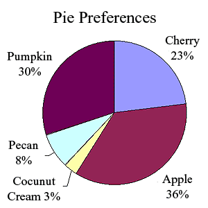
Pie Charts
A pie chart or graph depicts data as parts of a whole. The whole pie (or circle) represents the total of something, while each sliver represents a percentage of that total. Let’s take a look at the pie chart on the right.
The chart tells us that of the people who ordered dessert at a local pie shop, 36% ordered apple pie, while only 3% ordered coconut cream pie. By looking only at the shapes, we can see that three of the pies sold by the shop were very popular, and two were not so popular. What might the pie shop owner do with this information? Perhaps the owner could offer the most popular pies on the daily menu and the least popular pies as specials.
To see how easy it is to read and use a pie chart, complete the activity that follows with your classmates or friends.
Source: IPSI
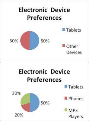
What’s your favorite gadget?
Ask a group of 10 students to tell you what their favorite electronic device is (i.e., tablet, phone, MP3 player, computer, or TV). Write down their preferences. Once you have all 10 responses, figure out the percentages. For example, if five students said they preferred their tablet computers, you could make a pie chart showing that half (50%) of the students prefer “tablet computers,” while the other half prefer “other devices.” Your pie chart would look like the first example on the right. What if you want to specify the “other devices” preferred by half of the students? Perhaps three students said they can’t live without their MP3 players (30%), and two said they prefer their phones (20%). Your pie chart would look like the second example on the right. You can now easily see that most of the students who responded prefer to use their tablets over phones or MP3 players.

Source: Mobile devices DSC 0988, HLLundgaard, Wikimedia
All you have to do is reread the explanation to the left of the charts to see that the pie chart is a much easier way to explain and represent the same information. Learning to read the information contained in pie charts and graphs helps you gain information in an efficient and accurate way.
Bar Graphs
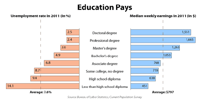
A bar graph is used to track changes over time or to make comparisons. Let’s look at the bar graph below from the U.S. Bureau of Labor Statistics, the department that tracks information about employment. This graph illustrates how more education made it less likely for certain groups of people to be unemployed during the recession in 2011 and presents information about how much money those groups earned over the same time period.
Source: Bureau of Labor Statistics, Department of U.S. Labor, http://www.bls.gov/emp/ep_chart_001.htm

Source: CGT Graduation web, College of Business
and Technology, Wikimedia
This graph not only shows which groups were less likely to be unemployed during the recession, but it also shows that those with a bachelor’s degree or higher made more money per week than the national average. Those with less than a bachelor’s degree made less money per week than the national average. The left side of the graph shows that those with an associate degree or higher were less likely to be unemployed than the national average, while those with less than an associate degree were more likely to be unemployed. In case you missed it, the average for all groups is shown at the bottom on each side of the graph.
 Using your notes, respond to the following question:
 What conclusions can we draw about the importance of education?
Sample Response:
People with more education make more money and are less likely to be unemployed than those who have less education.
Line Graphs
Source: FoodMeat, Wikimedia
Line graphs are most often used to depict changes over time. Sometimes these graphs may look confusing, but if you take your time and read them carefully, you will find that reading line graphs is not that difficult.
The graph below illustrates changes in meat consumption in the United States from 1910 to 2008. Take your time and locate the “beef” line, the “pork” line, and the “chicken” line. Notice that the years are listed along the bottom. If you read from left to right, you can tell whether the consumption of a particular meat has risen or declined for the decades between 1910 and 2008. The graph also shows the consumption of eggs, fish and shellfish, lamb, turkey, and veal.

Source: New York Times Knowledge Repository, http://www.nytimes.com/imagepages/2011/03/15/science/15food_graphic.html
For access to a text version of this graphic, click here.
This graph shows that the consumption of chicken has risen sharply since the 1950s. On the other hand, the consumption of beef has been erratic, peaking in the late 1970s and dropping significantly in the early 1980s.
Using your notes, respond to the questions that follow. When you’re finished, check your understanding to see some possible responses. - What happens to pork consumption after the “The Other White Meat” ad campaign begins?
- What happens to chicken consumption after the 1950s? Can you think of a reason for the change?
- How would you summarize the information on the graph that compares beef, chicken, and pork over the last fifty years?
Sample Response:
- The ad campaign seems to have some effect on the consumption of pork. The line rises slightly.
- Chicken consumption goes up sharply.
This could be due to easier, cheaper processing methods, the fact that chicken is considered a healthier choice than beef or pork, or access to fast food options such as Kentucky Fried Chicken. - Chicken and beef consumption have risen while pork consumption has remained about the same.