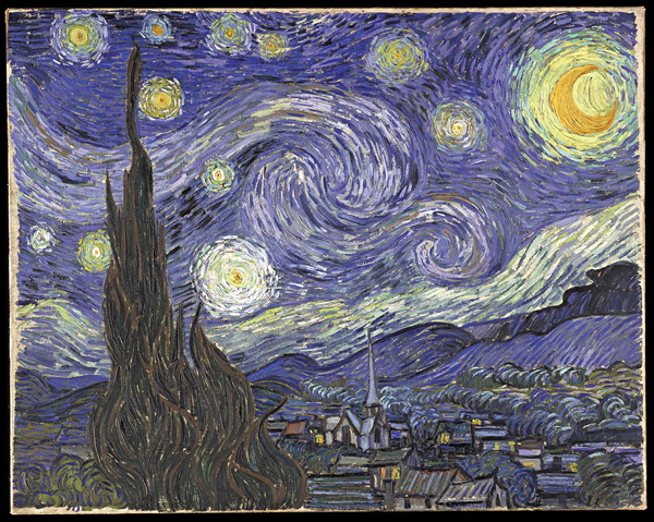
Source: VanGogh-starry night, Vincent Van Gough, Wikimedia
As you have learned, many texts are easier to understand with the addition of photographs and other visuals. Depending on the text, visuals might also be used for aesthetic appeal. Writers and designers working with a text must make decisions about which images to include so that the illustrations offer both information and visual interest. While reading other online lessons for English II, you may have noticed the many photographs and illustrations. The graphics are there to both support the text and add visual appeal.

Source: 2011 Wise Family Reunion 168, roger_mommaerts, Flickr
Imagine trying to describe a family reunion or special gathering to a relative who couldn't attend by writing about it. You might write pages of text. A better option might be to write a description of the event and accompany it with a group picture or a photograph of an activity at the reunion.
Often authors of complicated quantitative data and technical jargon use this strategy in their texts. Pictures and graphics make these concepts easier for you to understand.
Professional authors, editors, and graphic designers carefully use pictures and graphics to communicate a message. Visual appeal also depends on the correct placement of graphics and images and the choice of complementary colors, fonts, and other visually stimulating elements. As you will see, the next example includes helpful illustrations and other informative graphics but lacks visual appeal.
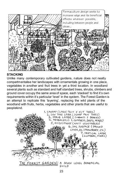
Source: Permaculture a Beginners Guide sample page, London Permaculture, Flickr
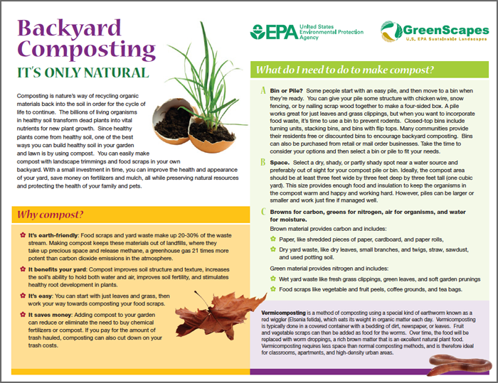
Source: Source: compost-guide, U.S. Environmental Protection Agency, epa.gov
To access the text for the image above, click here.
 Use your notes to respond to this question: Why might you make the decision to use one illustration over another one if you were choosing illustrations for an an essay on gardening, assuming that the essay addresses the topics of both “stacking” and “composting”?
Sample Response:
The drawings in the first article suggest a more intimate, casual approach to the essay. You might get this kind of information from a knowledgeable friend. In the second example, the photographs and colors are more polished and professional. The use of the photographs and colors helps to break up the text in the discussion of composting and adds visual interest to the text.