Visual representations can help us understand a text or increase our curiosity about a topic by making us look more closely. Sometimes visual aids such as charts and graphs are used to help us understand data that might be confusing if written in the text. When graphics are used, they should be clearly related to the text or provide added meaning. However, graphics shouldn’t take the place of text. Too many photographs, graphics, colors, and artwork can make the text confusing.
Look at the image below. Can you understand the purpose of this image just by looking at it without any text? It’s hard to say that it relates to anything. Unlike the photograph at the beginning of this lesson, this image must have more context.
Source: DiscreteLodAndCullExampleRanges.MaxDZ8, MaxDZ8
Now look at this image a second time and read the added caption.
Source: DiscreteLodAndCullExampleRanges.MaxDZ8, MaxDZ8
Partial image of radar screen
The caption tells us a little about this graphic, but it doesn’t go far enough. We need more explanation or something to compare it to in order to make any sense of it.
Look at the next graphic. The kind of text it might relate to is pretty clear. The graphic has a special purpose. You know this because it is clearly stated on the map itself.
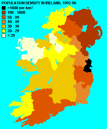
Source: Population density of Ireland map 2, Wesley Johnston, Wikimedia
Many times when you are reading informational or procedural text, an author will include photographs, drawings, or other graphics as aides to further understanding the text. Images and other graphics are important because they can connect us to the text emotionally or persuade us to learn more about a topic. If the article is about population movement in Ireland from the western part of the country to the eastern part and the reasons for this, then this map will aid us in visualizing this movement.
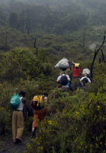
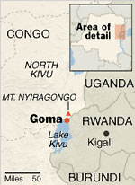
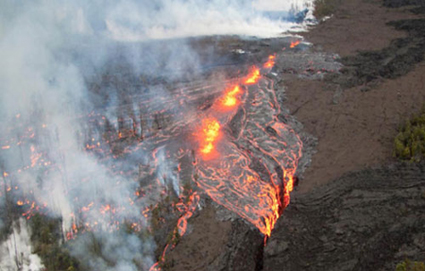
Read this article about a volcano in Africa. Look at how the pictures not only create visual interest for the story but also add clarity by showing what the volcano looks like and how it is contained to one area. Read the article and think about how the graphics add to your understanding of the text.
Some Congolese See Hope in a Caldron of Liquid Fire
Lydia Polgreen, New York Times
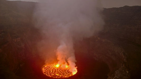
Source: Teofilo Valente Hernandez, New York Times Knowledge Repository
Some businessmen believe that Mount Nyiragongo, a volcano in eastern Congo, can attract tourist dollars to the battered region.
Teofilo Valente Hernandez, New York Times Knowledge Repository
Above, tourists and porters climb toward the top of Mount Nyiragongo to camp at the crater’s edge and marvel at the lake of lava.
The New York Times staff, New York Times Knowledge Repository
War, cholera and other ills have ravaged eastern Congo.
GOMA, Congo — Mount Nyiragongo glowers over this forsaken city, a sullen and capricious king crowned with thunderheads. . . . On a recent Saturday, at least three dozen climbers streamed up the steep trail to the 11,000-foot summit. Kalashnikov-toting park rangers accompanied the group, a reminder of how dangerous this place still is.
The visitors included a pair of New Zealanders on a cross-Africa trip, aid workers stationed in Congo and Rwanda and a Yale law student doing research on neglected humanitarian crises.
The path to the top is punishing. It was carved by lava from the first modern eruption, in 1977, and follows a ruthless upward trajectory for five long hours, first through thick forest, then through an increasingly stark, otherworldly landscape. Columns of steam and gas rise from fissures in the ground. Riotous wildflowers erupt from cracks in vast lava fields. Trees stripped of their leaves in the last eruption stand like scarecrow sentinels along the trail. The air grows colder and thinner.
“Unbelievable,” said Lindsay Silver, an aid consultant from California, as he stared into the mesmerizing caldron. “Incredible.”
The volcano is an object of reverence and fear for most Congolese, who have learned the hard way to stay clear of it.
After reading the text, you can see how the pictures create more understanding. Seeing the hikers in the second photo and the contained lava in the first photo allows you to understand that tourists might be able to visit the volcano because it’s not flowing freely. The map helps you understand exactly where the volcano is on the continent of Africa.
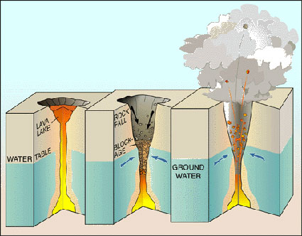
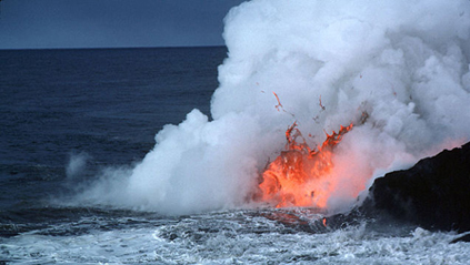
The next story has a similar subject but contains more illustrative graphics. Analyze this story the same way you did the first one, but this time also ask yourself, “What is this article about, what is happening, and what do I learn from the images and illustrations?”
Hawaiian Volcano Erupts, Producing Fiery Images but No Damage
Sarah Wheaton, New York Times
Source: Lava Flow, New York Times Knowledge Repository
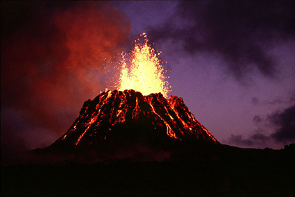
New cracks in Hawaii’s surface continued to spew lava on Monday in the latest punctuation of Kilauea Volcano, the mythical home of the Hawaiian fire goddess Pele.
Source: Mastin2 lakesA, Michael Diggles, Wikimedia
Beginning on Saturday afternoon, the fissures along the chain of craters that make up Kilauea’s East Rift Zone, on the southern end of Hawaii’s Big Island, created what resembled rivers of fire through the forest. Spatters of molten lava reached peaks of more than 80 feet on Sunday, according to the United States Geological Survey’s Hawaiian volcano observatory, reaching over the trees. In aerial photographs, incandescent flows of red and orange—colors produced by temperatures as hot as about 2,000 degrees Fahrenheit—left veins of ash grey as they churned through the green forest, before cascading into another deep crack in the earth.
Source: Limu o Pele, USGS, T.J. Takhashi, Wikimedia
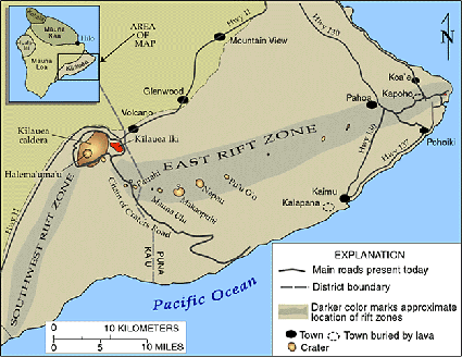
Source: Kilauea map, USGS HVO, A. Johnson, Wikimedia
The eruption also caused more than 150 detectable earthquakes in the area, which continued through Monday morning, though with decreasing frequency.
The fissures prompted the closing of parts of Hawaii Volcanoes National Park, including Chain of Craters Road and other trails and a campground in the area. The observatory also warned of lethal levels of sulfur dioxide near the vents. But because the eruptions are in a “very remote area” of the park, they do not pose a threat to people or towns, said Janet Babb, a geologist with the observatory.
Source: Pahoeoe fountain original-edit11, J.D. Griggs, Wikimedia
The fissures are between the rift zone’s easternmost craters, Napau and Pu’u O’o. Pu’u O’o (pronounced POOH-ooh-oh-oh) was formed in 1983, when Kilauea’s current eruption first began. The volcano is thought to be among the most active in the world.
The lava fissures coincided with a collapse of 380 feet in the crater floor of Pu’u O’o. The magma that flows upward from inside Earth and supports the floor was apparently diverted, Ms. Babb said. However, she added, geologists were working to determine if the fissures were the result of that diverted flow.
The lava lake inside Halema’uma’u, a crater on the opposite end of the rift zone near Kileau’s peak, also receded over the weekend, and its collapsing walls produced plumes of dust.
While both articles use photographs and other visuals, the second article has more illustrations, but it’s also more technical. The author sees a need to visually depict the geological changes that are occurring in the volcano in Hawaii. While comparing the two articles, note that both authors chose photographs and visuals to suit their different purposes.
 Now, use your notes to answer the next two questions. When you’re finished, check your understanding to see a possible response for each.
 - Based on what you see in the visuals and what you read in the text, what do you think is the purpose of the first article?
- Based on what you see in the visuals and what you read in the text, what do you think is the purpose of the second article?
Sample Response:
The article could appear in a travel magazine because it describes some of the tourists who have traveled to see the volcano. The purpose could be to describe the volcano for would-be tourists or for people who like to read about traveling to interesting destinations.
Sample Response:
This article is more scientific. It could appear in a magazine geared toward an audience interested in science and technology since it explains the mechanics of the volcano.
Now, let’s pretend that you are writing an article and you must choose just the right photographs to add to your writing. You will read the text after each number and then choose the better of the two photographs to accompany the text.
For the last exercise in this section, read the informational text presented in each question and then choose the best graphic to represent the text by clicking on it.
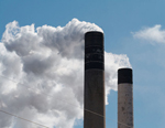
1. “WASHINGTON — Impatient with the slow pace of international climate change negotiations, a small group of countries led by the United States is starting a program to reduce emissions of common pollutants that contribute to rapid climate change and widespread health problems.”
Source: Smokestacks 3958, Dori, Wikimedia
If you chose the photograph of the smokestacks, you would most likely be emphasizing the emotional effect of the article discussing climate change and the hazards of factory pollutants that contribute to it.

Source: US Capitol dome Jan 2006, Diliff, Wikimedia
If you chose the photograph of the Capitol building, you are perhaps emphasizing the part of the article that says the United States is leading the way in efforts to reduce pollutants. The photo would function as a symbol of the United States.
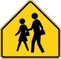
2. “When they go to public school, they’re in a whole new world, a whole world of different people and different values, which is what the world is like,” said Lyn Bollen, who grew up in Birmingham, England, and attended and taught at state-run schools. “Shielding them from that is doing them a disservice.”
Source: School sign US, MUTCD Chapter 7B, Wikimedia
The photograph of the sign is a symbol for children crossing in a school zone. The sign could be used as a symbol for school and everything that it embodies.
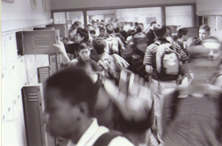
Source: Xaverian Hawks, November 8, 2010
The photograph of students in a crowded hallway illustrates the diversity. The photograph might have more emotional appeal.
3. “The Texas Centennial, marking 100 years of Texas independence, was officially celebrated in 1936, although local observances began in 1935 and the Central Centennial Exposition in Dallas and the Frontier Centennial in Fort Worth continued through 1937.”
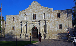
Source: Alamo in San Antonio, TX, foroyar22, Flickr
The photograph of the Alamo is a more romantic depiction of the article and Texas history. It is a photograph of a shrine to Texas history.
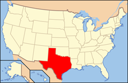
Source: Map of USA TX, Wikimedia
The photograph of the map shows Texas in relation to the rest of the country. The shape is an iconic symbol that carries emotional meaning with it.
4. “Three features made this an exceptional collection: cut, texture, and color. After last season’s womanly shapes and almost 1950’s femininity, this collection had masculine touches like smart, double-breasted coats and snug jackets. Shapely dresses remained, with a flair to the skirt and perhaps a belt, making a convincing collection of winter day wear.”

Source: clothes on the rail, net_efekt, Flickr
The photograph of the clothes rack suggests the idea that all of this season’s clothes fall into this category.

Source: fashion show,
marcelleitner bilderleben, Flickr
This photograph of the model in a pantsuit seems to illustrate the design details described in the article.
5. “It is exciting to learn that home cooking plays a larger role in the U.S. than we might have expected, and even more so to imagine and pursue the ways to make it easier and more popular than ever.”
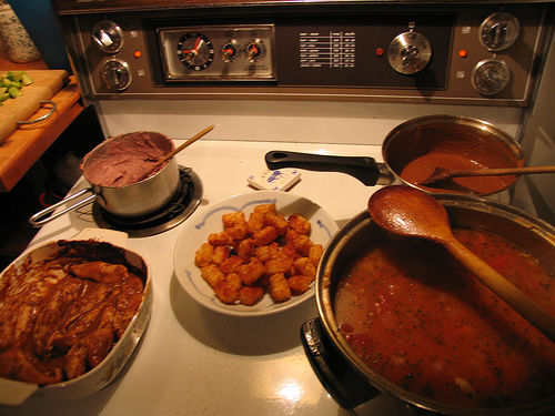
Source: IMG_3768, Robert Scales, Flickr
This photograph depicts a home cooked meal on the kitchen stove. It’s inclusion would serve to help readers imagine as they read the article.
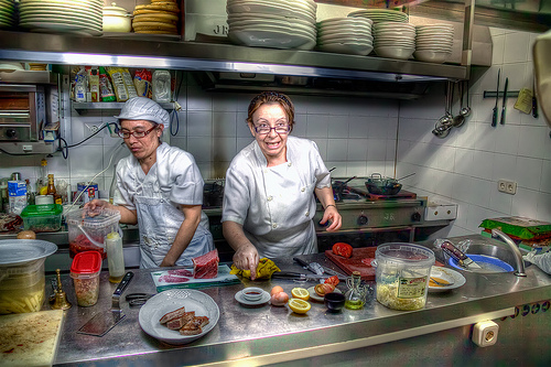
Source: Don’t forget the Soy sauce!
Restaurante Bocoy, Madrid HDR,
marcp_dmoz, Flickr
This photograph might be used for contrast if you are writing about eating out versus eating a home-cooked meal.