Source: Ages_of_teachers_pie_graph, IPSI
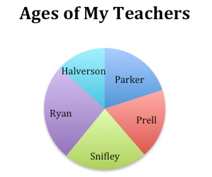
Now, how about some pie? The third major type of graph is the pie chart or circle graph. How could you make a pie chart of the ages of the teachers from the second section of the lesson?
Well, before you divide up a pie chart, you need a pie. In other words, you need a whole unit that represents what you will be dividing. How could you make a whole unit of all the teachers’ ages? Click on your answer.

You might find it surprising that many people complain about pie charts. Read this interview with Stephen Few. (Few has written three books on data visualization, so he is something of an expert on graphs.) After you read the interview, answer the questions that follow.
A CRITIC OF THE PIE CHART
from “Who Made that Pie Chart?” by Hilary Greenbaum and Dana Rubinstein
Like many of his contemporaries, the design consultant Stephen Few bemoans the ubiquity of pie charts. Here, he explains his perspective:
You wrote an essay called “Save the Pies for Dessert.” Why do you dislike pie charts so much? Pie charts are very popular, but it’s rare that a pie chart does the job better than a bar chart.
So, it’s fundamentally flawed? When looking at parts of a whole, the primary task is to rank them to see the relative performance of the parts. That can’t be done easily when relying on angles formed by a slice.
How come? Our eyes just don’t do that task well.
So why do people keep using them? I think there’s a basic appeal to the shape of a circle—a gut-level visual appeal.
1. What kind of graph does Stephen Few think can usually be used instead of a pie chart?
2. What is Stephen Few’s objection to pie charts?
Source: lemon meringue pie, happy via, Flickr
The trouble with pie charts is that they only give a general impression of the differences in the items being compared. In the “teacher’s age” pie chart above, you can see that Snifley and Ryan are older than the other teachers, but it’s hard to tell how much older they are or which of the two is the older.
True, if you look very closely, you can see that Ryan’s slice is bigger. The point is that getting this information would be easier from a simple bar graph like the one at the beginning of the lesson.
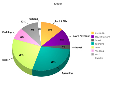
Source: budget, stephaniefink, Flickr
There are occasions when a pie chart is helpful because it is so familiar and easy to read. One of those times may be in planning a family budget. A pie chart can represent current spending and with that information, assist in adjusting a budget.
As a reader, of course, you can’t refuse to read pie charts. (You can’t say to your teachers, “Stephen Few says they’re not necessary, so I’m not going to look at them.”) If you are asked to read them, you need to do it.
The first thing to do when you come across a pie chart is to get a general impression of the biggest and the smallest slices. To provide readers with a general impression is probably why the author used a pie chart. If you are asked to compare slices that are similar, look for numbers either as labels in the slices or in a key at the bottom or on one side of the graph.