
Source: Bad sellings graph, baboon, Flickr
Remember that a bar graph can show how one member of a family compares to other members of a family according to one attribute. A line graph can also compare families based on one attribute, but a line graph is more appropriate if the families are made up of units of time. Test your ability to recognize “time families” by clicking on the items below that you think would count. To see if you are correct, check your understanding afterward.

All of these are time families, or in other words, they can be categories on a line graph.
The bar graph below shows units of time (in this case, “weekdays”) as the family being compared. We can convert it from a bar graph to a line graph by drawing a line connecting the tops of the bars as shown in the graphic on the right.
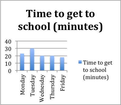
Source: Sample_time_bar_graph, IPSI
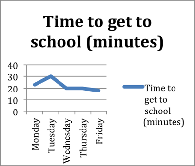
Source: Sample_time_line_graph, IPSI
These two graphs give readers identical information. The only difference is that a line appears where the top of each bar used to be.
However, there are differences in the focus each graph gives to the factual data. The bar graph shows us that on Tuesday, it took longer to get to school than on any other day. The bar graph also shows us that it took the least time to get to school on Friday.
The line graph displays the same information as the bar graph, and the line graph highlights the trends as well. The length of time it took to get to school peaked on Tuesday and then got shorter during the remainder of the week.
Line graphs are especially useful because they tell stories about trends. Line graphs also make it easy to compare two sets of data. For instance, a line graph might show the difference in time that it took two or more students to get to school each day for a week.
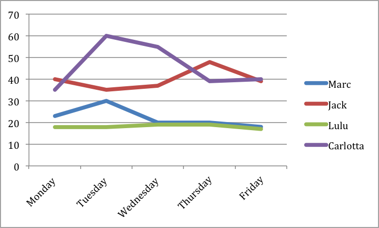
Source: Student_commute_times, IPSI
When you come across a graph like this in your reading, remember to get your bearings first, and then think about the observations the graph allows you to make. Let’s look at another line graph below that depicts the frequency of certain words used in books during a given year.
The answers to these questions will help you get your bearings in the graph below titled “Culturomics, Anyone?”
- What do the percentages tell us? How close are the percentages to 100%?
- What are the numbers across the bottom?
- What are the values indicated by each of the lines?
- What are the differences in the values of the percentages?
 Answer these questions using your notes. When you’re finished, check your understanding to see some possible responses.
 - The percentages are percentages of the uses of a single word relative to all the words used in books published during a specific time period.
- The numbers across the bottom are the indicators of the categories. In this case, the categories are the years between 1950 and 2000.
- Each line indicates the trend in the use of the word it represents.
- The percentages are measured in tenths of a percent, so each number represents a one-tenth of a percent increase or decrease.
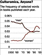
Source: Federal Reserve Bank of Cleveland, New York Times Knowledge Network
Here are additional questions just to make sure you have your bearings.
1. Which word was used more frequently in 1960, “men” “or “women”?
2. Which word was used less frequently in 2000, “men” or “women”?
Here’s a sample observation about the graph:
We start with the line indicating how many times the word “men” was used in books in 1950. That line is way above the line indicating how many times the word “women” was used. How does the story continue, though? The trend shows the use of the word “men” decreases and the use of the word “women” increases starting about 1970. Since that time, the word “women” has consistently been used more.
Line graphs do not tell us why the numbers change, but they sometimes allow us to guess.
3. Can you guess why the number of uses of “women” increased so suddenly and so dramatically around the 1970s?
Look at the chart below about employment as a percentage of the population. First, you need to get your bearings. To do so, respond to the questions about the chart in the activity that follows. Click on your answer for each question.
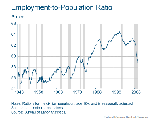
Source: Federal Reserve Bank of Cleveland, New York Times Knowledge Network
Do you see how getting your bearings can help you understand graphs better? Now, let’s move on to pie charts in the next section.