Which Graphic Representations Work Best?
Now that we know what kinds of graphic tools are available to us, the next question is which kind of graph or chart is the best for certain data? The answer to that depends on what you want to say. As you now know, graphs and charts can present data in many ways, so you need to ask yourself “what do I want to show?”
Example: Let’s say you want to compare smartphones. You would use a chart because, as you know from Section 3, “A chart is a graphic representation that makes a comparison.”
Now it’s time to show what you have learned by answering some questions about data sets and graphic representations.
- Choose the best graphic representation for this data set. Suppose you are writing a paper, and you need to graphically represent the participants of an international study. Specifically, you need to show the number of students from each country that participated. How could you best display this information? Which graphic representation would you choose to represent the data shown in the table below and why?
 Write your response using your notes. Check your understanding when you are finished to see a possible response.
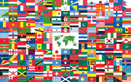
Source: The world flag 2006, The World Flag, Wikimedia
| Students By Country | |
|---|---|
| Country | Number of Students |
| Canada | 68 |
| Mexico | 109 |
| China | 72 |
| El Salvador | 115 |
| Ecuador | 83 |
| Vietnam | 94 |
| USA | 253 |
Sample Response:
The bar graph is the best way to display a comparison among groups because it gives a better graphic representation of the size of each group compared to the others.
- Choose the best graphic representation for this data set. Use the data below, which was recorded in a survey students took about “How I get to school.” Decide which graphic representation would best display this data if your purpose is to show what percentage of students walk, what percentage ride the bus, and what percentage arrive by car to school each day. You need to be able to visually compare each part to see how it relates to the whole.
Write your answers using your notes. Check your understanding when you are finished to see a possible response. 
Source: School Bus - Carpenter - Ledgemere Transportation – 8, BMRR, Wikimedia
| Response | Number | Percent |
|---|---|---|
| Walk | 30 | 10% |
| Bus | 180 | 60% |
| Car | 90 | 30% |
Sample Response:
The circle graph is the best choice to represent this data set because a circle graph shows the relationship of parts to a whole. These graphs are good for showing percentages because they show the relationship or size of the various percentages to the whole.
For the next set of questions, analyze the graphic representations of data and answer some questions about them.
- What does this graph tell us about students' movie preferences?
Write your response using your notes. Check your understanding when you are finished to see a possible response. 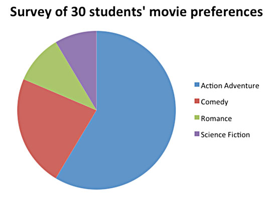
Sample Response:
The information in this circle graph tells us about what kinds of movies these students prefer. The largest percentage of students surveyed likes action/adventure movies. The next largest percentage of students prefers comedies. A smaller percentage of students likes romance movies, and the smallest percentage of students prefers science fiction movies.
- What does this graph tell us about these teams and how they scored?
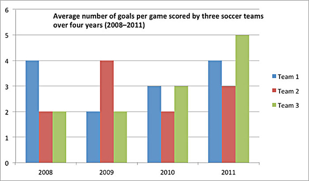
Source: Institute for Public School Initiatives, UT Austin
- What does this graph tell us about how these students performed?
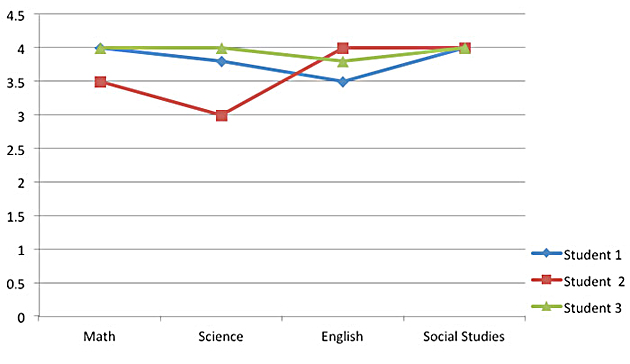
Source: Institute for Public School Initiatives, UT Austin
- Look at the table below and answer questions about the data in the table. What does the information in this table tell us about the technology used by students in the Tech Club?
| Tech Club | Desktop Computer | Laptop Computer | Tablet | Smartphone |
| Student 1 | Dell | Dell | Samsung | Motorola Droid |
| Student 2 | Mac | Mac | iPad | iPhone |
| Student 3 | Dell | Sony | iPad | iPhone |