Transforming Data from Words to Graphic Representations in Graphs
Source:IPSI
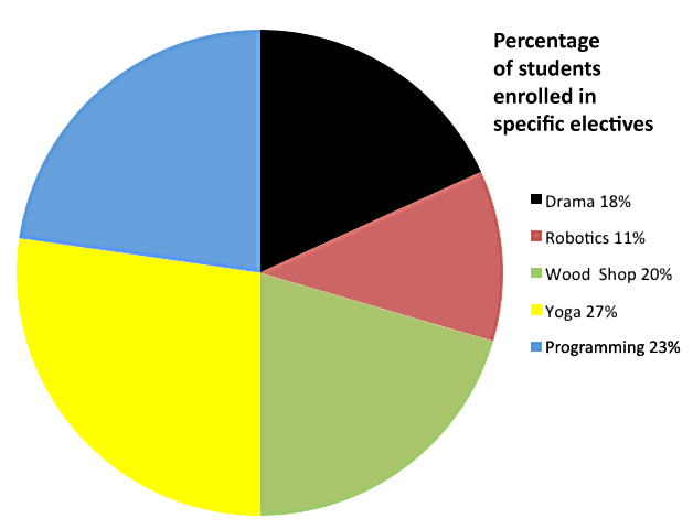
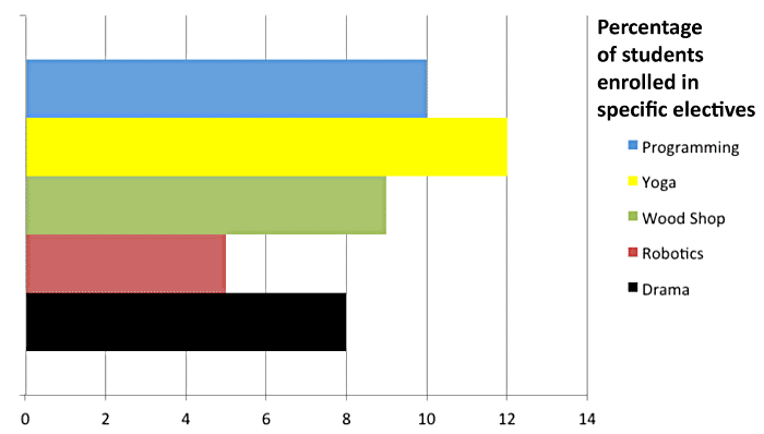
The graphic representations above and below show the results of a survey that asked 44 students to name their electives. The circle graph represents all 44 students as a whole. The bar graph below separates the classes to compare them to one other. The title, “Percentage of students enrolled in specific electives,” tells you what is being represented in each graph. The circle graph shows the percentage of students taking each class. The bar graph below compares the number of students taking each class. While representing the same number of students (44), each graph has a different function.
The circle graph’s function is to show the percentages of students in each class relative to the entire group of 44 students. Each pie wedge represents a part of the whole. Yoga, at 27%, is the largest wedge.
Source:IPSI
The bar graph has a different function but uses the same survey about electives. The bar graph compares classes to each other based on the number of students taking each class. Using this graph, you can clearly see that more students (12) choose to take yoga than robotics (5).
Technically speaking, graphs illustrate statistical information: the relative values of numerical quantities. Different types of graphs are used to show different types of statistical data. Here are some examples:
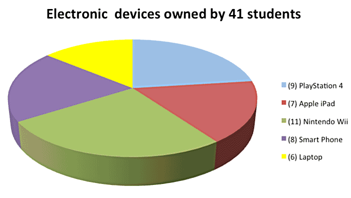
The next circle graph, sometimes known as a pie chart, shows the relationship of parts to a whole. The whole pie chart always represents 100% of something. The various parts, or wedges, represent percentages of the whole.
Source: IPSI
This pie chart represents a survey of 41 students. They were asked which electronic device they owned. If they owned more than one, they were asked which one they owned first. The list on the right tells you which device is represented by each part of the graph. We have done the math for you and you will notice that the largest wedge is the green wedge, which represents 26% of the whole. This wedge represents the Nintendo Wii. The next largest wedge is the blue wedge (PlayStation 4) representing 23% of the whole. With this information, you could safely say that almost half (49%) of the students surveyed own either a Nintendo Wii or a PlayStation 4.
Answer the following questions about this circle graph.
- Can you estimate what percentage of students own either an Apple iPad, smartphone, or laptop?
- According to the size of the wedges, more students own either an Apple iPad or a PlayStation 4 than a laptop or a smartphone.
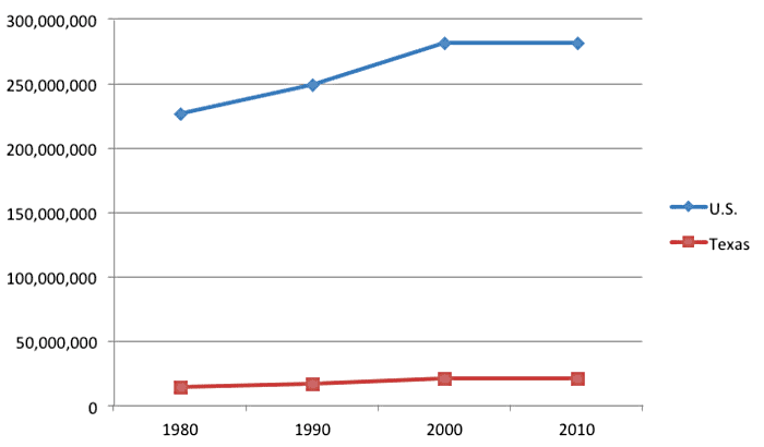
The next kind of graph is called a line graph. Line graphs show changes in numerical values over time. Here is an example:
Population growth in Texas compared to overall U.S. population growth 1980–2010
Source: IPSI; data from the U.S. Census Bureau
This line graph shows how the Texas population grew from 1980 to 2010 in comparison to the growth of the United States population. The title of this graph provides this information: “Population growth in Texas compared to overall U.S. population growth 1980–2010.” Going from left to right and bottom to top, the quantitative data includes the number of people in millions and the length of time studied from left (earliest) to right (most recent). A box to the right tells you that the blue dotted line represents the United States and that the red dotted line represents the population of Texas.
Here is some of the other information we can get from this graph:
- From 1980 to 2010, the population of Texas grew rather than shrunk.
Examine the red line to get this information. The red point on the far left indicates that the population of Texas in 1980 was lower than the population in 2010, indicated by the red point on the far right. - The United States population grew by a much greater percentage during the time shown in the graph.
To get this information, examine the blue line. The first blue point indicates that the population of the United States in 1980 was lower than the blue point that represents 2010. The U.S. difference is more pronounced than than that of the red Texas line. The U.S. line seems to travel upward more sharply than the Texas line during the two decades pictured.
The last type of graph we will look at is called a bar graph. Bar graphs include vertical (up and down), or horizontal (left to right) bars to show types of information. The length of each bar indicates a quantity. Here is an example:
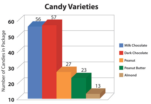
Source: IPSI

Source: M&M, naathas, Flickr
This bar graph features M&M varieties. The categories or flavors of M&Ms are on the right. On the left is a line that indicates the number of M&Ms in each package. Each colored bar tells you what flavors of candies are in each package.
Using the bar graph above, answer the following questions:
- Which type of M&Ms featured in the bar graph has the most candies in each package?
- According to the graph, the combined number of Peanut Butter M&Ms and Peanut M&Ms is greater than the number of Milk Chocolate M&Ms in a single package.
Do you see how useful these graphic representations are? When you report quantitative data of the kind represented in these examples, you can use graphic tools to make your point without crowding the data into a paragraph. By using a circle graph, line graph, or bar graph, you help your reader understand the data and its significance. Now you will be asked some questions to test your new knowledge of graphic representations of data.
In this activity, you will transform data into a graphical representation using the information in the table below. The column on the left represents the types of graphic tools that you read about in this section. The other three columns represent the functions that graphics can perform. For each graphic listed on the left, click in the column that matches its function. Be sure to click within the same row. Some of the graphic types may have more than one right answer.