
Source: get_a_job, apenny, Flickr
OK, so your dad wants you to get a job so that you can start saving for college. You know that you don’t have time for anything more than a Saturday job, and you want to prove it to him. You could write down how you spend your study time like this:
In English I read for an hour and spend another 45 minutes writing; I spend an hour and a half on algebra because I go back over my work; I then spend an hour and a half on biology; social studies only takes up an hour of my time. My electives take up about half an hour or 45 minutes each. I am also in the debate club and that takes up two or three hours sometimes. I play soccer in the fall and run cross-country in the spring. Athletics take up a minimum of five hours a week.
By choosing this approach, you take a chance that your dad might stop reading your endless list before he even gets to the extracurricular activities. The list is confusing and does not clearly represent what you are trying to say. What if you could transform the same information into an easy-to-read graphic representation?
Here is an example. Take a look at this graphic that explains the same information.
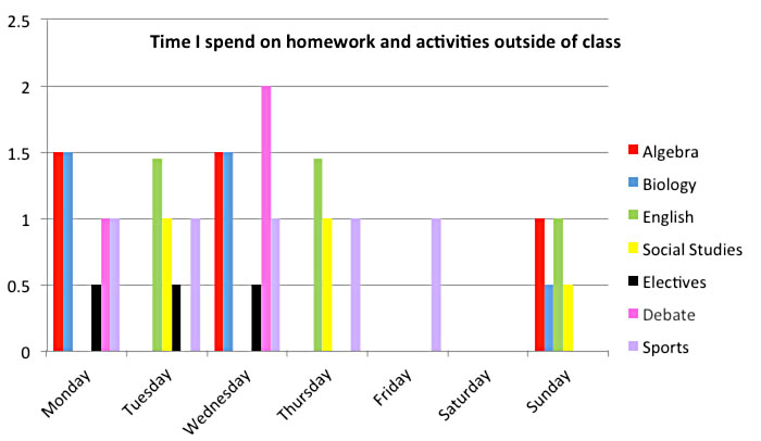
Source: IPSI
This bar graph tells the same story about time spent on homework and other activities but presents a much clearer picture. The time spent on each activity is shown on the vertical line to the left, and the days and subjects are represented on the horizontal line. Each subject is color coded, so you can compare it to others.
The transformation of data into visual forms such as graphs, diagrams, and charts is called graphical representation of data. In nearly all of your classes, you will be presented with factual, quantitative, or technical data. This data will be displayed in several different ways depending on how it is taught or how it is used. To understand this data, you will need to know how to interpret graphical representations.
You will soon see that graphs, charts, and diagrams have many uses and benefits. Graphic representations can
- enhance understanding,
- clarify comparisons,
- create a more powerful impression,
- present characteristics of information in a simpler way, and
- make it easier to understand patterns over time.
When you finish this lesson, you will be able to analyze factual, quantitative, and technical data in graphs and charts and use it in your studies (or to convince your dad that you’re too busy to get a job).