 Source: World Population Distribution Map, eHow
 Across this earth, people live in many different places. People live in cities, on islands, or in mountainous regions. This is called population distribution. World population distribution varies from place to place. There are some areas where the climate or terrain makes it difficult for people to live (example: Antarctica, remote jungles in Belize, or desert corridor of Asia). These places are sparsely populated since few people live there. Other places have better conditions, such as a more temperate climate and more abundant resources, for people to live. These places are densely populated since they contain many people in a given area (examples: New York City, China, and Europe).
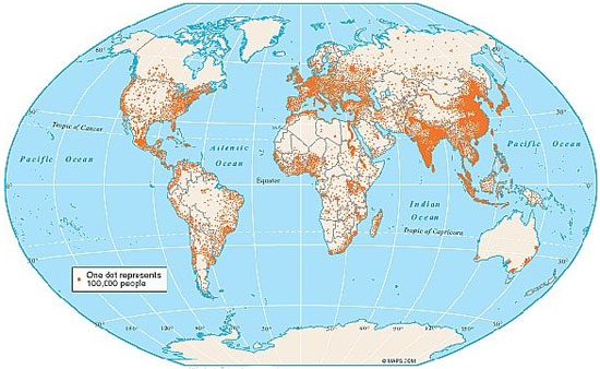
World Population Distribution, 1998
Source: World Population Distribution Map, eHow The map above is an example of a World Population Distribution Map. In this map, each dot represents 100,000 people. The more dots there are, the more people that live in the area. The opposite is also true: the fewer dots there are, the fewer people that live in the area.
Based on this map, which continent had the most sparse population distribution?
Interactive popup. Assistance may be required. You are correct if you said, Antarctica. Notice on this map there are no dots on Antarctica.
Which continent had the most dense population distribution? Interactive popup. Assistance may be required.
This answer was a little tougher; Asia has the world's highest population. Although there are sparsely populated areas in Asia, such as Russia, other countries such as China and India have higher populations.
Understanding Population Distribution
 Activity: Match the term or statement on the left and drag it to the term or statement that completes it on the right.
Projected World Population Distribution by Region (percentage)
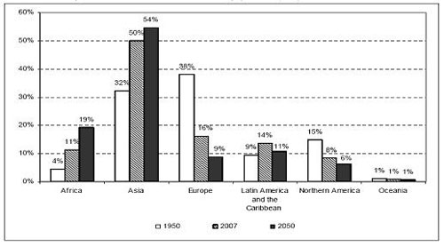 Source: Projected World Population Distribution by Region, World Bank Blog.
 Look at the graph above. Are there any patterns that you can find? What regions seem to be increasing in their percentage of world population? What regions seem to be decreasing in their percentage of the world's population? By 2050, what region is projected to have the highest percentage of the world's population?
Record your observations in your notes. Interactive popup. Assistance may be required.
Possible Answers: The population of Africa and Asia will continue to increase while Europe and North America will decrease. Latin America and the Caribbean will decrease slightly and Oceania will remain stable. By 2050, the highest percentage of the world's population will still exist in Asia.