In the last section, you studied the difference between positive linear associations and negative linear associations. Once you know that a data set has a linear association, you can use a trend line to make predictions. In this section, you will practice generating a trend line and using that trend line to make predictions from the data.
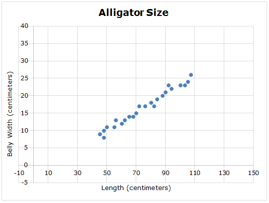
The graph below shows the relationship between the length of an alligator (in centimeters) and the belly width of an alligator (in centimeters).

![]() Click and drag the circles below to place a trend line on the graph. Your trend line will not connect every point, but should follow the trend in the data.
Click and drag the circles below to place a trend line on the graph. Your trend line will not connect every point, but should follow the trend in the data.
Use the trend line you estimated in the graph to answer the questions below.
Interactive popup. Assistance may be required.
Approximately where does your trend line cross the y-axis?
Interactive popup. Assistance may be required.
What is the change in y as compared to the change in x for the two points on the trend line?
Interactive popup. Assistance may be required.
What point on the trend line has an x-coordinate of 30?
Interactive popup. Assistance may be required.
What point on the trend line has a y-coordinate of 35?
How does a trend line help you to make predictions from a scatterplot?

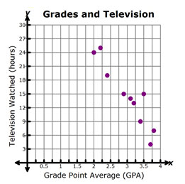
Use a trend line to estimate the grade point average a student would have if they watched 27 hours of television each week.

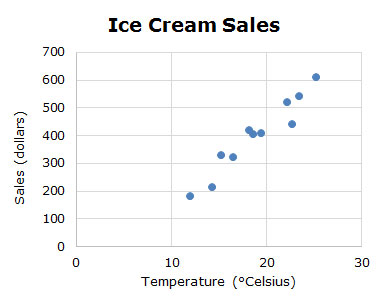
Use a trend line to estimate the temperature required for $700 in ice cream sales.