Use the graphing applet to make a scatterplot of population versus year number. Use the scatterplot that is generated to answer the questions that follow.
In this section, you will investigate ways to make predictions about data using scatterplots and other graphs.
The table below contains data describing the population of the United States as determined by the census.
| Year | Year Number (since 1900) |
Population |
|---|---|---|
| 1940 | 40 | 132122446 |
| 1950 | 50 | 152271417 |
| 1960 | 60 | 180671158 |
| 1970 | 70 | 205052174 |
| 1980 | 80 | 227224681 |
| 1990 | 90 | 249464396 |
| 2000 | 100 | 281421906 |
Use the graphing applet to make a scatterplot of population versus year number. Use the scatterplot that is generated to answer the questions that follow.
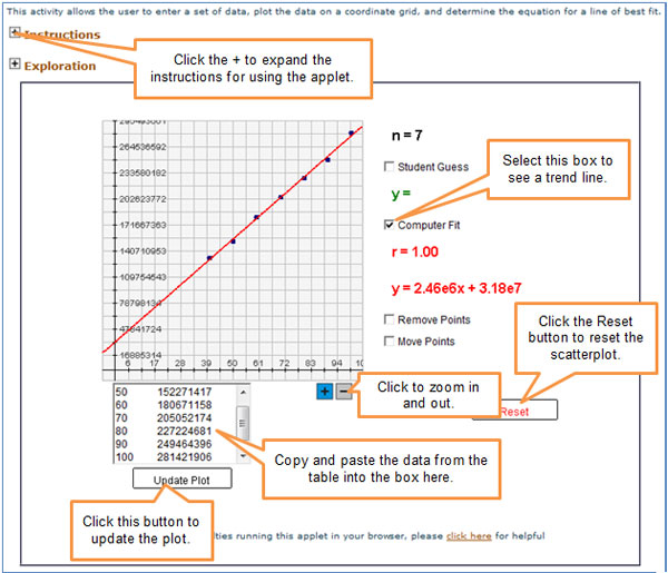

To better use the applet, copy and paste the data from this table, which is a simplified version of the table that was presented above.
| Year Number (since 1900) |
Population |
|---|---|
| 40 | 132122446 |
| 50 | 152271417 |
| 60 | 180671158 |
| 70 | 205052174 |
| 80 | 227224681 |
| 90 | 249464396 |
| 100 | 281421906 |
Question 1
What was the approximate U.S. population in 1985?
Interactive popup. Assistance may be required. How many years after 1900 is the year 1985?
Interactive popup. Assistance may be required.
What two data points would the year 1985 lie between?
Interactive popup. Assistance may be required.
About 240,000,000 people
Question 2
What was the approximate U.S. population in 1965?
Interactive popup. Assistance may be required. How many years after 1900 is the year 1965?
Interactive popup. Assistance may be required.
What two data points would the year 1965 lie between?
Interactive popup. Assistance may be required.
About 193,000,000 people
Question 3
If the population continues changing at the current rate, what will be the approximate population in 2010?
Interactive popup. Assistance may be required. How many years after 1900 is the year 2010?
Interactive popup. Assistance may be required.
Use the zoom features to zoom out in the graph, and estimate the data point for the year 2010.
Interactive popup. Assistance may be required.
About 304,000,000 people
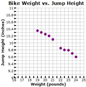
The graph shows the relationship between the weight of a bicycle and the maximum height of a jump off the ground.