| Written out in words or stated as a problem |  |
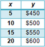 |
Organized as numbers in a data table |
| Written symbolically in an equation | 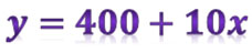 |
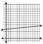 |
Arranged visually in a graph |
The table below demonstrates four methods used to represent relationships.
| Written out in words or stated as a problem | |
|
Organized as numbers in a data table |
| Written symbolically in an equation | |
|
Arranged visually in a graph |
In this lesson, we will focus on generating and interpreting relationships that are arranged visually in a graph.
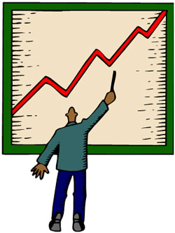
People frequently use graphs to interpret relationships and make predictions. For example, business people use graphs of data to make purchasing decisions for their company. Investment bankers use graphs of data to make decisions about which stocks and bonds to buy. The media also uses graphs to communicate information to the public about the economy, population, and other socially important statistics.
Because graphs are so frequently used, it is important to understand how to correctly interpret data that is presented in graphical form.