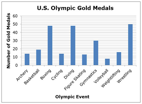
In addition to seeing data in tables, you will also see data presented in graphical form. Consider the bar graph below, which shows the total number of Olympic gold medals earned by United States athletes in different events from 1896 to 2010.
It is important to note that there are events, such as track and field events or swimming events, in which athletes representing the United States have earned well over 300 gold medals. This graph represents a small portion of the total events sponsored by the Olympic Games.

Decide if the given conclusion is valid or invalid, based on the information presented in the graph, by clicking on the column header for the appropriate category.
In addition to interpreting graphical information by reading the graph and performing calculations using the data, the structure of the graph could cause misleading conclusions.
The line graph below shows the amount of city taxes paid by the Langostino family for the tax years 2010 through 2013. The graph was provided by their city with the city tax bill.
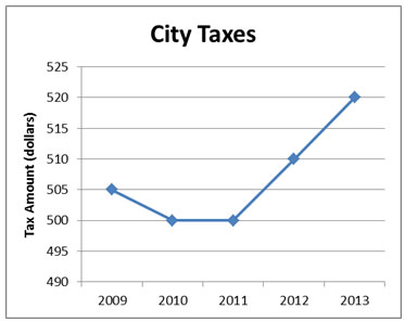
Mrs. Langostino studied this graph and carefully considered each of the following conclusions. Help her decide if the conclusions are valid or invalid, based only on the information in the graph.
Interactive popup. Assistance may be required.
Does the graph show how the Langostino family's city taxes compare to taxes in other cities? Interactive popup. Assistance may be required.
This conclusion is not supported by the graph.
Interactive popup. Assistance may be required.
This conclusion is not supported by the graph.
Interactive popup. Assistance may be required.
What are the actual amounts of city taxes for 2011 and 2013?
Interactive popup. Assistance may be required.
This conclusion is invalid. City taxes in 2011 were $500, and city taxes in 2013 were $520. $520 is not double $500.
Interactive popup. Assistance may be required.
What are the actual amounts of city taxes for 2011, 2012, and 2013?
Interactive popup. Assistance may be required.
This conclusion is valid. City taxes in 2011 were $500, city taxes in 2012 were $510, and city taxes in 2013 were $520. The increase from 2011 to 2012 was $10, and the increase from 2012 to 2013 was also $10.
Interactive popup. Assistance may be required.
To calculate the percent increase, find the difference between city taxes in 2011 and 2013, and then divide this number by the amount of city taxes in 2011.
Interactive popup. Assistance may be required.
This conclusion is valid. City taxes in 2011 were $500, and city taxes in 2013 were $520. The increase from 2011 to 2013 was $20, and $20 ÷ $500 = 0.04 = 4%.
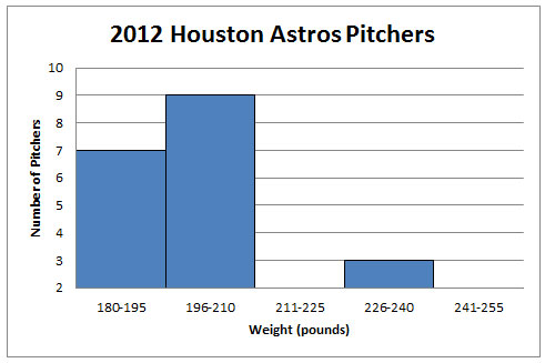
Based on the information presented in the graph, decide which of the following conclusions are valid or invalid.
Interactive popup. Assistance may be required. Be sure to pay attention to the minimum value on the vertical axis.