
In the last section, you used data from a sample to make predictions about the population. In this section, you will use the data presented in graphs to determine if particular conclusions can be made.
Cynthia wanted to know what colors of vehicles the teachers at Northside Middle School drive. So she went to the first row in the teachers’ parking lot and counted the number of different vehicle colors. The data she collected are shown in the bar graph below.
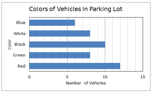
 Spin the wheel below to see the conclusions Cynthia made from the data in her graph. Decide if each conclusion is true or false by clicking on the appropriate button. Click “next” to see the next conclusion.

Jacob thought that Cynthia’s car color study was interesting, so he went into the same row of the teachers’ parking lot to look at the age of each car. Jacob determined the car’s age by subtracting the year the car was made from the current year. He represented his data in the dot plot shown below.
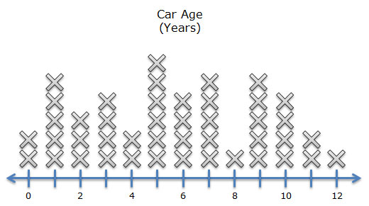
Spin the wheel below to see the conclusions Jacob made from the data in his graph. Decide if each conclusion is true or false by clicking on the appropriate button. Click “next” to see the next conclusion.
How can you use a bar graph to make comparisons of one category compared to the whole set of data represented in the graph?

How is a bar graph like a dot plot? How are they different?
For questions 1 and 2, the graph below shows how different sources were used to generate electricity in Texas during 2010.
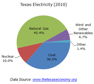
Determine whether or not each of the following statements can be supported from the information in the graph.
Interactive popup. Assistance may be required.
Determine the total percentage of electricity that was generated using natural gas and coal. Convert the fraction 9 over 10 9 10 to a percent, and compare the two values.
Interactive popup. Assistance may be required.
Determine the total percentage of electricity that was generated using nuclear energy and wind and other renewables. Convert the fraction 1 over 5 1 5 to a percent, and compare the two values.
For questions 3 and 4, the box-and-whiskers plot, or box plot, shown below represents the average monthly low temperatures and high temperatures in San Antonio, Texas.
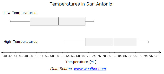
Determine whether or not each of the following statements can be supported from the information in the graph.
Interactive popup. Assistance may be required.
In a box-and-whiskers plot, or box plot, the vertical line inside the box describes the median of the data set. Use this vertical line, along with the number line, to approximate the median temperature for each data set.
Interactive popup. Assistance may be required.
The range of average high temperatures is indicated by the distance along the number line between the end of each whisker.