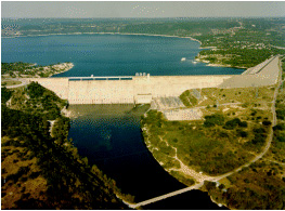
Source: w:en:User:Nv8200p, Mansfield Dam.gif, Wikimedia Commons
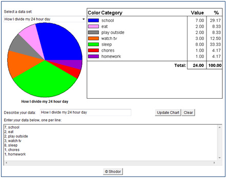
Circle graphs and Venn diagrams are types of graphs that can be used to show relationships within a data set or between data sets. In this section, you will explore how to interpret and use circle graphs.
Source: w:en:User:Nv8200p, Mansfield Dam.gif, Wikimedia Commons
The Lower Colorado River Authority maintains a chain of six reservoirs, or man-made lakes, along the Colorado River. These six reservoirs are collectively called the Texas Highland Lakes and are very important sources of drinking water for people who live in Central Texas and farmers throughout the Colorado River valley. These lakes are also great places for summer fun!
The table shows the capacity, when full, of each of the six lakes in acre-feet. An acre-foot is an amount of water that will cover 1 acre of land to a depth of 1 foot. Think of it as a square prism with a base area of 1 acre and a height of 1 foot.
Texas Highland Lakes |
|
Lake |
Capacity |
Lake Buchanan |
875,566 |
Lake LBJ |
133,216 |
Lake Marble Falls |
7,186 |
Lake Travis |
1,134,956 |
Inks Lake |
13,668 |
Lake Austin |
24,644 |
Source: www.LCRA.org |
|
Before making a circle graph of these data, answer the following questions.
 Interactive popup. Assistance may be required.
Since we need a reasonable estimate, we may round to the nearest thousand.
The total capacity can be found by adding the capacities of the six lakes together.
876,000 + 133,000 + 7,000 + 1,135,000 + 14,000 + 25,000 = 2,190,000 acre-feet
Interactive popup. Assistance may be required.
Since we need a reasonable estimate, we may round to the nearest thousand.
Interactive popup. Assistance may be required.
Since we need a reasonable estimate, we may round to the nearest thousand.
The total capacity can be found by adding the capacities of the six lakes together.
876,000 + 133,000 + 7,000 + 1,135,000 + 14,000 + 25,000 = 2,190,000 acre-feet
Interactive popup. Assistance may be required.
Since we need a reasonable estimate, we may round to the nearest thousand.
The following table contains the data from the previous table in a format that will make it easy to copy and paste into the circle graph builder interactive.
Capacity of Texas Highland Lakes | |
|
875566, Lake Buchanan |
|


Click the image below to open a circle graph generator in a new window.
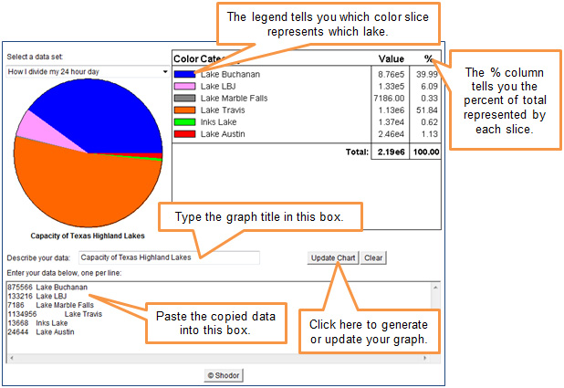
Which two lakes hold the most capacity in the Texas Highland Lakes system?
Interactive popup. Assistance may be required. Which two slices of the circle graph are the largest?
Interactive popup. Assistance may be required.
Lake Travis and Lake Buchanan
Which lake holds more than half of the total capacity of the Texas Highland Lakes system? How can you tell?
Interactive popup. Assistance may be required. Which slices of the circle graph is larger than a semicircle?
Interactive popup. Assistance may be required.
Lake Travis, because its slice is larger than half of a circle.
How does the circle graph help you to see the relative size of each part of the system at a glance?
Interactive popup. Assistance may be required. What does each slice of the circle graph represent?
Interactive popup. Assistance may be required.
The size of each slice of the circle represents the fraction (or percent) of the system that each individual lake holds. The circle graph as a whole lets you quickly see how the size of each slice compares to the sizes of the others.

Population of the United Kingdom |
|
Country |
Population (millions) |
England |
52.23 |
Northern Ireland |
1.80 |
Scotland |
5.22 |
Wales |
3.01 |
Which of the following circle graphs best displays this data?
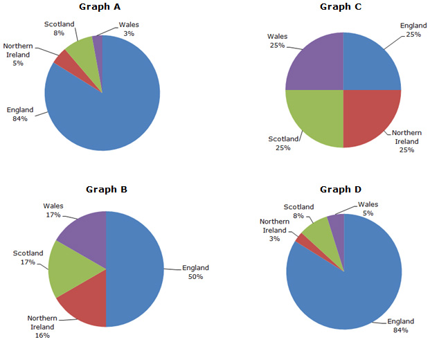 Interactive popup. Assistance may be required.
Graph D
Interactive popup. Assistance may be required.
Graph D