
In this lesson, you interpreted graphs by evaluating the data around the center (mean and median); evaluating the spread (range and interquartile range); and by evaluating the shape and distribution of the graph, including skew. This helps you understand the way data is represented or displayed.
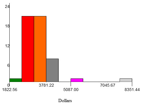
The two plots below represent personal energy expenditures by state. The same data is used in both the box plot and the histogram.
Personal Energy Expenditure in 2012 by State in Dollars
 Click on each tab to review the center, range, interquartile range, and shape of the data set above.