 The graphs presented in the lesson are below. Observe the commonalities between the graphs by clicking on each graph.
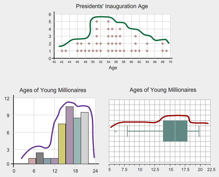
 In the previous sections, you interpreted the center and the data surrounding the center, and the spread of dot plots, stem-and-leaf plots, histograms, and box plots. In this section, you are going to use the information discussed in previous sections, and interpret the meaning of the graph based on its shape.
The graphs presented in the lesson are below. Observe the commonalities between the graphs by clicking on each graph.
Use the information from the interactive to answer the following questions:
Interactive popup. Assistance may be required.
Look at the colored curves, and describe the shape that is the same in most of them.
Interactive popup. Assistance may be required.
Look at the colored curves. There is a curve and a long line before or after the curve. Decide if the long line is before or after the peak.
The graphs above had long tails either to the right or the left of the peak. These graphs are skewed, which means they have a “long tail” to either the left or the right of the peak.
Click on an outer circle to read a definition and see a graph for each data distribution description.

Use the interactive and graphs above to answer the following questions:
Interactive popup. Assistance may be required.
Look for the peak of the graph. Are there an equal number of data values to the right and left, or are there more data values to the right or to the left of the peak?
Interactive popup. Assistance may be required.
The skew shows values that are far away from the center or peak. Would these values ever be important?
Click on the correct column header to move the graphs into the column representing their skew.