Solubility curves or solubility graphs typically look like the one shown below. This shows the solubility of many different ionic compounds.
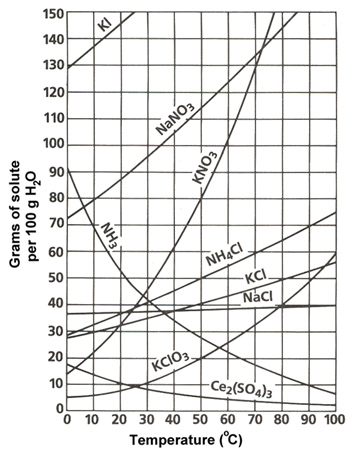
Source: Solubility Chart, Sasketchewan Schools
This solubility graph has a lot of information on it. Let’s walk through this graph to understand it better. Use your notes to answer the following questions:
- What is the label of the x-axis?
Interactive popup. Assistance may be required.
Check Your Answer
- What is the label of the y-axis?
Interactive popup. Assistance may be required.
Check Your Answer
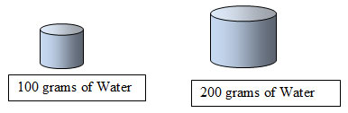
- If the graph displayed the amount of H2O per 200 grams instead of 100 grams, how would the amount of solute to be dissolved change? (See hint below.)
 Interactive popup. Assistance may be required.
Check Your Answer
- Describe the general trend in solubility of the salts shown on this graph.
Interactive popup. Assistance may be required.
Check Your Answer
- NH3 is the exception to this trend. NH3 is gaseous ammonia. Why do you think it has the opposite trend of the other compounds?
Interactive popup. Assistance may be required.
Check Your Answer
Now let’s take a closer look at how to read a solubility curve.
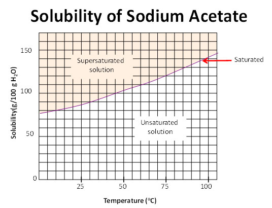
Source: Solubility curve, Pennsylvania Dept of Education
Trace the solubility of a substance with increasing temperature.
- The curved line represents saturation.
- Below the curve, the solution is unsaturated.
- Above the curve the solution is supersaturated. This means there is more solute than the solution can hold.
The solution can be classified as the following:
- Saturated if crystals remain at the bottom of the container
- Supersaturated if no crystals remain at the bottom of the container
