
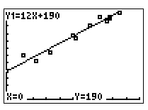
Now it will appear like the applet. Here is one possible result.
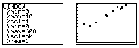
Next you need to be able to do this same activity using your graphing calculator. We'll use this data first since you've used it before.
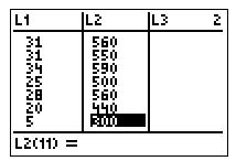
| Sandwich | Total Fat (g) | Total Calories |
| Hamburger | 18 | 260 |
| Cheeseburger | 40 | 320 |
| Quarter Pounder | 56 | 420 |
| Quarter Pounder with Cheese | 70 | 530 |
| Big Mac | 31 | 560 |
| Arch Sandwich Special | 31 | 550 |
| Arch Special with Bacon | 34 | 590 |
| Crispy Chicken | 25 | 500 |
| Fish Fillet | 28 | 560 |
| Grilled Chicken | 20 | 440 |
| Grilled Chicken Light | 5 | 300 |
Think about the steps you would take to plot these points using paper and pencil. You have to take similar steps on the calculator.