Let’s look at some real examples of data correlation.

Example 1

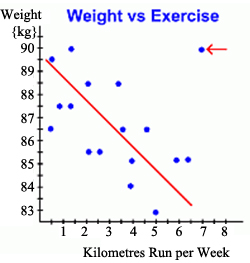
This graph illustrates how a person's weight might change depending on how much they run in a week. It records the change in weight for a group of people, all of whom started out weighing 90 kg, and each of whom runs a different number of kilometers each week, for an unspecified period.

Can you see a trend line for the data points? Yes, it naturally decreases.

Here, as the kilometers run each week increases from person to person, the weight of each person seems to decrease.

This is an example of a weak or low negative correlation. It's negative because as the number of kilometers increases, the weight decreases. It's a weak correlation because the data points line up only weakly.

Hint: Practice describing the meaning in the situation using the words increase and decrease.

Source: University of Illinois, MSTE

For example, our conclusion might be that as the number of kilometers run each week increases, a person's weight decreases.

Here's the same graph with the line of best fit drawn in. Notice again that the points only 'sort of' line up ... that's why it's a weak negative correlation.

But notice also the point in the upper right of the graph (red arrow). This data element is an anomaly; it doesn't fit the pattern of the other points, and we didn't use it when drawing the line of best fit. We call that an outlier.

But we still have to explain it. Why is it there?

This anomalous point represents one person who ran 7 km every week, but whose weight stayed at 90 kg. We might search for an explanation, perhaps even interviewing that person, and discover that the only food that person ever eats is fatty fast food ... thus explaining their lack of weight loss!

Source: University of Illinois, MSTE

Example 2

Emily kept a record of the number of hours she studied and the test grades that she received.

Determine whether the graph shows a positive correlation, a negative correlation, or no correlation.

If there is a positive or negative correlation, describe its meaning in the situation.

Image shows scatterplot with hours of study on the x axis and test scores on the y axis. The y values increase with each increase in x value. Interactive popup. Assistance may be required.

Check Your Answer

Positive correlation. As the number of hours of study increase, test score increase; or, the more hours you study, the higher your test scores.Close Pop Up
Source: Unknown

Example 3

The graph below shows how a chemical reacts to changing temperature or atmospheric pressure. Determine whether the graph shows a positive correlation, a negative correlation, or no correlation. If there is a positive or negative correlation, describe its meaning in the situation.

Image shows a scatterplot with Temperature as the x axis and Concentration as the y axis. y values increase with each increase in x value.
Source: Unknown

Interactive popup. Assistance may be required.

Check Your Answer

Positive correlation. As the temperature increase, concentration of the chemical increases.Close Pop Up