A scatterplot displays a relationship between two sets of data. A scatterplot can also be called a scattergram or a scatter diagram.
With a scatterplot, a dot represents a single data point. With several data points graphed, a visual distribution of the data can be seen.
Depending on how tightly the points cluster together, you may be able to discern a clear trend in the data.
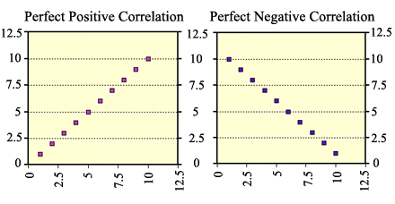
The closer the data points come to forming a straight line when plotted, the higher the correlation between the two variables, or the stronger the relationship.
 |
If the data points make a straight line going from near the origin out to high y-values, then the variables are said to have a positive correlation. If the data points start at high y-values on the y-axis down to low values, the variables have a negative correlation. |
An example of a situation where you might find a perfect positive correlation, as in the graph on the left above, would be if you were purchasing candy bars for $1 each. As number of candy bars increase, the amount of total cost increases.
Hint: If you read the graph like you read a book, from left to right, you can read the trend as increasing (positive) or decreasing (negative).
A situation where you might find a strong but not perfect positive correlation would be if you examined the number of hours students spent studying for an exam versus the grade received. This won't be a perfect correlation because two people could spend the same amount of time studying and get different grades. But in general the rule will hold true that as the amount of time studying increases so does the grade received.
 |
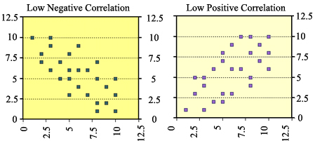
Notice that the data points are spread out even more in these graphs. The closer the data points lie together to make a line the higher the correlation. In these graphs, there is still a trend for the data, so we would say that the data has a weak or lower correlation. |

|
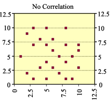
Notice that the data points are spread out even more in this graph. There is no trend to this data. Thus, there is no correlation. |