Source: The Public Address Effect, Andrew Drubber, Flickr
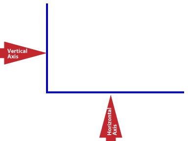
Bar graphs and line graphs are both organized with a vertical axis up the side and a horizontal axis across the bottom. Each axis represents something. You can think of the vertical axis, the line that goes up and down, as a “ruler” since it is used to measure the quantities being charted. Along the horizontal axis, the line that runs left to right, you often see a set of categories. These are the names of the items being compared.
Source: IPSI
Which graphical components are best? Well, it depends on what you want them to do. Let’s make a comparison of what a table does that a graph won’t, and what a graph can do superbly that a table can’t do very well.
Imagine that you are writing an article about four students who are training to run a 5K. In this article, you want to include different graphical components to make the information more clear and to add new information. Think about which graphical elements will add most to your article.
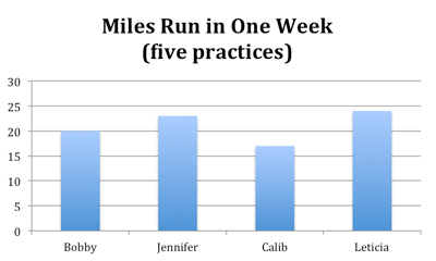
First, consider this table, a simple grid of runners and the number of miles each one ran.
| Miles Run in One Week (five practices) | ||||
|---|---|---|---|---|
| Bobby | Jennifer | Calib | Leticia | |
| Miles run | 20 | 23 | 16 | 24 |
The table is easy to read, but you need to be sure you look at the title. Otherwise, you might not know that these numbers apply to one week of training. By reading the table, you can easily see that Bobby ran 20 miles, Jennifer ran 23, and so forth.
Now, let’s look at a graph. It’s easy to see that each of the “bars” stands for one of the students because their names appear on the horizontal axis. However, what do the numbers on the left side (vertical axis) of the graph mean? There are numbers starting with zero that get bigger as they go higher. But what is being counted? Look at the title: the numbers on the vertical axis stand for “miles.” The title is just as important as it was in the table.
Source: IPSI
Can you see that the information in the table and the bar graph are the same? The facts are the same. However, the two graphical components function differently as part of a text. Think about how they are different by answering the questions below.

- Which graphical component tells you most quickly and easily who ran the most and the least during one week?
- What is the average number of miles run by the four runners during the week? (Reminder: To find the average, add up all the numbers for miles run and divide that number by the number of runners, which is 4.)
- Which graphical component was most useful in answering question 2 above?
- Who do you think may be the best two runners to choose for a long distance relay?
- Which graphical component was most useful in answering question 4 above?
When comparing the two graphical components, you find that the table provides you with the exact numbers of miles, making it easier to do the arithmetic when you want to compare mileages. The bar graph, though, provides a visual representation of the mileages so that you can quickly compare relative performances. In other words, the table gives specific information. The bar graph gives general comparisons. Each serves a function.
One more thing to consider: You can make inferences from both the table and the bar graph. For example, you could infer from looking at the table that Calib is the weakest runner or that he is injured. Using the bar graph, you can easily compare Calib’s performance for the week to the other runners.
What other inferences can you make? Read the think-aloud below to get an idea of how someone might make inferences using the “Miles Run in One Week” table and bar graph.
Well, the first thing I want to be clear about is the topic, so I’ll look at the titles. OK, I understand that the table and graph will tell me “Miles Run in One Week.” I guess each person ran a different amount. I wonder why the coach didn’t just tell them all to run the same distances each day. One inference I can make from the bar graph is that the coach for these runners is either individualizing the practice runs or leaving it up to the runners to determine how far they run each week. What if someone asked me to support that inference with textual evidence? Well, that’s not hard. I could show them that each runner was running a different distance. I could either refer them to the height of the bars on the graph or the numbers on the table. I can make another inference that Leticia is really working hard, and Calib maybe is slacking off a little. If I want to support that inference, it’s going to be easier to look at the table rather than the bar graph. Why? Well, the bar graph gives us 5 mile increments, not exact numbers. If I look at the table, I can support my inference very easily by saying the Leticia ran eight more miles than Calib.