Understanding Charts and Graphs
Charts and graphs are another way to make statistical information visual and accessible. Charts and graphs are most often used to illustrate trends, to examine data, and to compare and contrast data.
Let’s look at some specific types of charts and graphs.
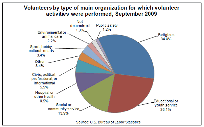
Pie charts (circle graphs) are used to illustrate parts of a whole. The U.S. Bureau of Labor Statistics recently published a pie chart that illustrates where Americans who volunteer spend their volunteer time.

Source: Volunteers by type of organization, U.S. Bureau of Labor Statistics
If you were researching ways Americans participate in protecting the environment, you could see from this graph that less than 2.2% of Americans who volunteer do so to help the environment. We also know that this number is less than 2.2% because the category is combined with animal care.
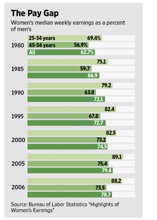
Simple bar graphs are used to show percentages, but more complex graphs compare data. Let’s look at the graph below from the Wall Street Journal. In addition to comparing women’s pay to men’s, the chart shows women’s pay as a percentage of men’s pay. The pay of women of two different age ranges are also compared to each other.

Source: Pay gap bar graph, U.S. Bureau of Labor Statistics
What might we infer from this chart? What I notice is that women who are between 25-34 years of age earn more than women who are between 45-54 years of age. I would like to know why this is so. One reason might be that some women leave the workforce for periods of time to have and raise children.
You might also notice that the bar graph shows women’s pay versus men’s pay from 1980-2006. By looking at the bar graph from top to bottom, you can see that women’s pay, although still not equal, has increased during this time period.
Line graphs are used to illustrate changes over time. The graph below illustrates a percentage change per year of the cost of going to college over 20 years. The solid line represents tuition and fees, and the dotted line represents the cost of all goods and services. This graph tells me that since 1981, the increases in the cost of attending college have risen faster than the cost of anything else a person has to pay for. That includes housing, medical care, and food. When I look at this graphic, I wonder what was happening with the economy during the times when the cost of everything but attending college dropped. Sometimes the cost of college rose while the cost of living dropped.

Source: College tuition cost bar graph, U.S. Bureau of Labor Statistics
Now that you’ve seen the types of visuals you are likely to encounter in the research process, we will review what you’ve learned.