Lesson Template
Part 1 - TEKS Glossary and Syllabus
- Lesson title: Evaluating Data Presented in Graphics, Tables, and Charts
- Student-friendly summary of lesson: You will learn how to look at and evaluate the information given in tables, graphs, and charts.
- At least 3-5 key words in the lesson, including their definitions from the TEKS Glossary:
Introduction
Our world is dominated by images. We have stories presented to us in visual form by movies and television. Companies ask us to buy their products through commercials and print ads. Because images are so prevalent in our world, writers often use visual aids, including graphics, tables, charts, and graphs to help their readers understand complex data.
Writers use visuals in their writing to:
- Grab the reader’s attention.
- Make the work more interesting to read.
- Help readers understand what they are reading.
Because we live in a visual world, you must be able to read and interpret visuals. In this lesson you're going to look at examples of graphics, tables, charts, and graphs and learn how to interpret their data. You'll be able to use this skill to enhance your research.
Click here to see a YouTube video demonstrating graphs.
Understanding Graphics
A graphic, sometimes called an infographic, is a great way to represent data in a visual way. For example, when the weather reporter on the news shows a picture of Texas with the temperatures for various cities, you’re seeing a graphic. Timelines are also graphics that convey information. Newspapers make great use of graphics in their stories. They grab the reader’s attention and often get readers to read a story they might not have otherwise read. An interview with the New York Times graphics director Steve Duenes revealed that billionaire Bill Gates credited an infographic about third world health problems with causing him to become interested in donating money to fight AIDS in Africa.
Let’s take a look at the graphic below. Suppose you are writing a paper about the 2008 election and the factors that led the Democrats to victory. You could use the graphic below as a source. This graphic from the New York Times gives a picture of the frequency of words spoken by the candidates in each party. What information can we get from this picture? We can see that the large bubbles represent the words spoken most often by the candidates, and the smaller ones represent the words spoken less often. If the creator of this graphic were to write this data in a paragraph, it would be hard to keep all of the numbers straight while reading it, but in picture form we can see that the Democrats used the words “change” and “McCain” most often, and the Republicans used “God” and “Taxes” most often.

Democrats used some words much more often than others because those bubbles are bigger. Republicans used more words equally because there are more bubbles that are similar in size. Again, this graphic is most useful because it shows a picture of the data that makes it easier to understand.
Let’s look at another graphic and see what it tells us. This is a map from the Wall Street Journal. Look over it and then answer the questions below using your Take Notes Tool.

You can write the answers to the questions below using your Take Notes Tool. Check your understanding when you are finished.
Instructions for Using the Take Notes Tool
- Click the Take Notes button in the left Epsilen navigation menu to open the Take Notes popup page.
- You may edit the Title or leave it as the title of the course.
- Enter your notes in the Content box.
- Click the Save button. You may now refer to these notes whenever you open the Take Notes popup page.
- Has childhood obesity increased or decreased in most states?
- How much has childhood obesity increased in Texas since 2003?
- What years does this map cover?
- It has increased.
- 20.4%
- 2003-2007
You’ll notice that it’s easier to gather big picture data than to gather details from a graphic. However, one graph can’t tell us everything. If you wanted to know which state had the highest increase in obesity, this map wouldn’t be the best source because you would have to look at every dark blue state on the graph to see the percentage increase of each state. Graphics are great when you want to find a general trend such as the increase in childhood obesity across the United States, or when you want to jump-start your research by analyzing a graphic for questions that intrigue you. For example, this map makes me wonder why obesity rates decreased in states like West Virginia and North Carolina?
In the next section, you’ll look at getting information from tables. Although still visual, tables provide more detail than a graphic.
Understanding Tables
Statistical data can be dull and hard to read in sentences and paragraphs, so writers will often use tables. The reader can scan and interpret data more easily and quickly when it’s presented in a table. In the previous section, we looked at a graphic from the New York Times that illustrated the frequency of words used by political candidates in 2008. The visual shows that Democrats had a few words that they used very frequently, as depicted by the large bubbles, while Republicans used specific words more evenly since the bigger bubbles were closer to the same size. What if we wanted to know which candidates were using which words? If the writer tried to illustrate the speakers of each word using the same bubble-type graphic, it would be even more confusing than just writing it as a paragraph. Instead, the writer used a table to illustrate the data. Here’s what it looks like.
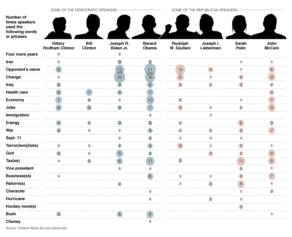
This table shows who said each frequently spoken word. What information could I get from this graphic that might help me answer a research question? What if I wanted to know the answer to this question: “Was the Democrats’ victory due to negative campaigning against the Republicans?” What data might help me figure that out? Well, Barak Obama and Joe Biden spoke their opponent’s name frequently, and they also spoke of former president Bush frequently as well. This doesn’t tell us whether the mentions were negative, but it does tell us that we might want to look at video clips and transcripts of speeches by Obama and Biden to learn more about their mentions of John McCain and George Bush.
Let’s look at another table and answer a few questions about the data it illustrates. Suppose you are getting ready to apply to colleges and you want to know which majors have the highest earning potential. This table from Vanderbilt University shows entry-level and mid-career earnings by major.
|
Undergraduate Major |
Starting Median Salary |
Mid-Career Median Salary |
Ratio of Starting to Mid-Career Salary |
|---|---|---|---|
Accounting |
$46,000.00 |
$77,100.00 |
1.68 |
Business Management |
$43,000.00 |
$72,100.00 |
1.68 |
Economics |
$50,000.00 |
$98,600.00 |
1.97 |
Finance |
$47,900.00 |
$88,300.00 |
1.84 |
History |
$39,200.00 |
$71,000.00 |
1.81 |
Industrial Engineering |
$57,000.00 |
$94,700.00 |
1.64 |
Information Technology (IT) |
$49,100.00 |
$74,800.00 |
1.52 |
International Relations |
$40,900.00 |
$80,900.00 |
1.98 |
Management Informations Systems (MIS) |
$49,200.00 |
$82,300.00 |
1.67 |
Marketing |
$40,800.00 |
$79,600.00 |
1.95 |
Math |
$45,400.00 |
$92,400.00 |
2.04 |
Mechanical Engineering |
$57,900.00 |
$93,600.00 |
1.62 |
Political Science |
$40,800.00 |
$78,200.00 |
1.92 |
Psychology |
$35,900.00 |
$60,400.00 |
1.68 |
Sociology |
$36,500.00 |
$58,200.00 |
1.59 |
Using the Take Notes Tool, answer the questions below. Check your understanding when you are finished.
- Which major earns more than twice its entry-level salary by mid-career?
- Which major has the lowest entry-level salary?
- Which major has the lowest percent change, or ratio, between entry-level and mid-career salaries?
- Math
- Psychology
- Information Technology
How could you use this information? If you’re strictly motivated by earning potential, you could start researching colleges with the best math departments. If you’re determined to become a sociology major even though the earning potential is at the very bottom of the graph, you might want to research colleges with the best scholarships or cheapest tuition so that you won’t be mired in debt when you graduate, since your earning potential and ability to pay back loans won’t be as high. We might also want to research whether these mid-career salaries are affected when workers go back to school and attain graduate degrees.
In the next section, you’ll look at charts and graphs that provide more information than a graphic and are more like a picture than a table.
Understanding Charts and Graphs
Charts and graphs are another way to make statistical information visual and accessible. Charts and graphs are most often used to illustrate trends, to examine data, and to compare and contrast data.
Let’s look at some specific types of charts and graphs.
Pie charts are used to illustrate parts of a whole. The U.S. Bureau of Labor Statistics recently published a pie chart that illustrates where Americans who volunteer spend their volunteer time.
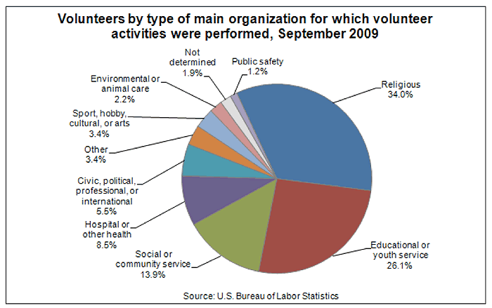
If you were researching ways Americans participate in protecting the environment, you could see from this graph that less than 2.2% of Americans who volunteer do so to help the environment. We also know that this number is less than 2.2% because the category is combined with animal care.
Simple bar graphs are used to show percentages, but more complex graphs compare data. Let’s look at the graph below from the Wall Street Journal. In addition to comparing women’s pay to men’s, the chart shows women’s pay as a percentage of men’s pay. The pay of women of two different age ranges are also compared to each other.
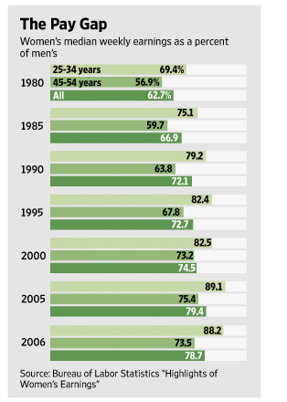
What might we infer from this chart? What I notice is that women who are between 25-34 years of age earn more than women who are between 45-54 years of age. I would like to know why this is so. One reason might be that some women leave the workforce for periods of time to have and raise children.
You might also notice that the bar graph shows women’s pay versus men’s pay from 1980-2006. By looking at the bar graph from top to bottom, you can see that women’s pay, although still not equal, has increased during this time period.
Line graphs are used to illustrate changes over time. The graph below illustrates a percentage change per year of the cost of going to college over 20 years. The solid line represents tuition and fees, and the dotted line represents the cost of all goods and services. This graph tells me that since 1981, the increases in the cost of attending college have risen faster than the cost of anything else a person has to pay for. That includes housing, medical care, and food. When I look at this graphic, I wonder what was happening with the economy during the times when the cost of everything but attending college dropped. Sometimes the cost of college rose while the cost of living dropped.

Now that you’ve seen the types of visuals you are likely to encounter in the research process, we will review what you’ve learned.
Your Turn
Now let’s see you make a chart!
Let’s use the second set of information in the chart above to show how students spend their day. You will make a pie chart using the data and the link provided below.
Chart Data
Here's your information about students based on a 24 hour day.
Sleeping – 6 hours
Going to School – 7 hours
Studying – .5 hours
Watching TV – 2.25 hours
Working – 5 hours
Hanging out – 1.5 hours
Eating – 1 hour
Reading – .25 hours
Getting ready for school – .5 hours
Instructions on Using Chartle
Chartle is a free software program that allows you to create charts and graphs. Now that you’ve reviewed the data, go to the Chartle.net link below. Halfway down the webpage, click on Data and enter the activities and the amount of time shown for each. I’ve entered the first few activities for you already. When you finish entering the data, you can publish or share your pie chart for future reference.
Here’s the link to create your pie chart.
Problems with Chartle? Chartle.net uses the Java web-browser plugin. Please update to the latest Java plugin. Restart your browser. If this Java plugin test runs successfully, the Chartle applet should so as well.
Resources
Resources Used in This Lesson: Bibliography
“Childhood Obesity Map.” The Wall Street Journal. July 20, 2009. http://s.wsj.net/public/resources/documents/
st_childobesity_20090720.html.
Shellenbarger, Sue. “Bridging the Pay Gap.” Front Lines (blog). The Wall Street Journal. June 16, 2008. http://blogs.wsj.com/frontlines/2008/06/16/bridging-the-pay-gap/.
“Talk to the Newsroom: Graphics Director Steve Duenes.” New York Times. February 25, 2008. http://www.nytimes.com/2008/02/25/business/media/25asktheeditors.html.
US Bureau of Labor Statistics. “Back to College: BLS Spotlight on Statistics.” September 2010. http://www.bls.gov/spotlight/2010/college/.
“Words They Used.” New York Times, September 4, 2008. http://www.nytimes.com/interactive/2008/09/04/us/
politics/20080905_WORDS_GRAPHIC.html.