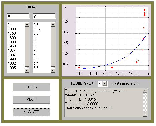
This graph has a low coefficient correlation. But if you tried a linear or quadratic graph you’ll find an even lower number. The problem is the wide range of data. The x-values go from 0 to 1000 to 1750.
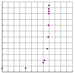
It can be difficult to tell the difference between quadratic and exponential scatterplots. The exponential graphs will become very steep. The last 4 points graphed above look vertical.
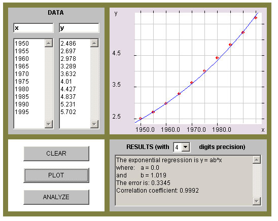
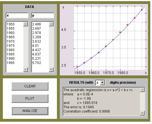
Here is the data in a shorter range of years.
| Year | (Billions) |
| 1950 1955 1960 1965 1970 1975 1980 1985 1990 1995 |
2.486 2.697 2.978 3.289 3.632 4.01 4.427 4.837 5.231 5.702 |
Population growth is usually an exponential scatterplot. But if you graph these points you don’t see the nearly vertical points.
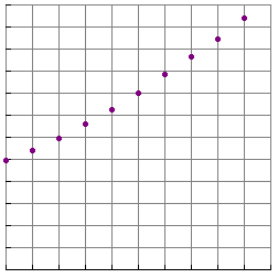
Comparing the quadratic regression with exponential you see below that the quadratic regression gives a higher correlation coefficient. That’s because the data only in that shorter ranger fits a quadratic graph, but the overall data is still exponential. So be careful and analyze the entire data set, otherwise you may get an incorrect model as in the graphs below.