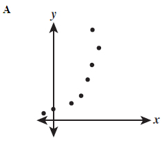
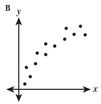
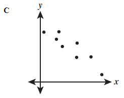
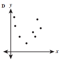
Which set of data would give a negative correlation?
 |
 |
 |
 |
A. Graph A
Incorrect. The trend increases.
B. Graph B
Incorrect. The trend increases.
C. Graph C
Correct! These data points decreased.
D. Graph D
Incorrect. This graph has too many outliers, thus, no linear correlation at all.
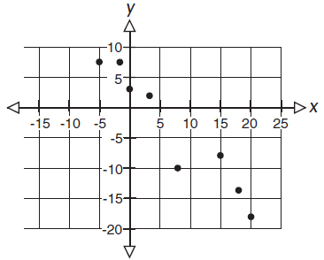
Which best describes the relationship shown on the graph?
Please select A, B, C, or D.
A. A negative correlation.
Correct! As x-values increase, y-values decrease.
B. No correlation.
Incorrect. Describe the graph's meaning in the situation using the words: As x-values increase, y-values....Try reading it with your finger from left to right and watch your hand go up or down.
C. A positive correlation.
Incorrect. Describe the graph's meaning in the situation using the words: As x-values increase, y-values....Try reading it with your finger from left to right and watch your hand go up or down.
D. A constant correlation.
Incorrect. Describe the graph's meaning in the situation using the words: As x-values increase, y-values....Try reading it with your finger from left to right and watch your hand go up or down.
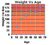
The graph below shows the relationship between a person’s age and their weight in pounds.
Which best describes the relationship shown on the graph?
Please select A, B, C, or D.
A. Negative trend
Incorrect. As a person gets older, their weight __________.
B. Positive trend
Correct! In the scatter plot, as a person's age increases, his weight will increase, too. Try reading it with your finger from left to right and watch your hand go up or down.
C. Constant trend
Incorrect. This is here to trick you. Try describing the graph "as a person gets older, their weight _______". Try reading it with your finger from left to right and watch your hand go up or down.
D. No trend
Incorrect. There is a definite trend to the data. Try reading it with your finger from left to right and watch your hand go up or down.
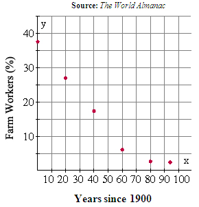
The table shows the percent of U.S. workers in Farm Occupations.
Which best describes the relationship shown on the graph?
Please select A, B, C, or D.
A. Negative trend
Correct! As time passes, the percent of farmer occupations decrease.
B. Positive trend
Incorrect. Try reading it with your finger from left to right and watch your hand go up or down.
C. Constant trend
Incorrect. This is here to trick you. Try reading it with your finger from left to right and watch your hand go up or down.
D. No trend
Incorrect. There is a definite trend to the data. Try reading it with your finger from left to right and watch your hand go up or down.
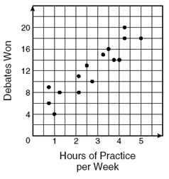
The members of a debate team answered a survey about hours of debate team practice and number of team wins. The graph shows the results of this survey.
Which best describes the relationship shown on the graph?
Please select A, B, C, or D.
A. Negative trend
Incorrect. As hours of practice increase per week, the number of wings ________. Try reading it with your finger from left to right and watch your hand go up or down.
B. Positive trend
Correct! As the debate team increased their hours of practice, the number of wins increased.
C. Constant trend
Incorrect. This is here to trick you. Try describing the graph "hours of practice increase per week, the number of wins ________." Try reading it with your finger from left to right and watch your hand go up or down.
D. No trend
Incorrect. There is a definite trend to the data. Try reading it with your finger from left to right and watch your hand go up or down.