Understanding Tables
Statistical data can be dull and hard to read in sentences and paragraphs, so writers will often use tables. The reader can scan and interpret data more easily and quickly when it’s presented in a table. In the previous section, we looked at a graphic from the New York Times that illustrated the frequency of words used by political candidates in 2008. The visual shows that Democrats had a few words that they used very frequently, as depicted by the large bubbles, while Republicans used specific words more evenly since the bigger bubbles were closer to the same size. What if we wanted to know which candidates were using which words? If the writer tried to illustrate the speakers of each word using the same bubble-type graphic, it would be even more confusing than just writing it as a paragraph. Instead, the writer used a table to illustrate the data. Here’s what it looks like.
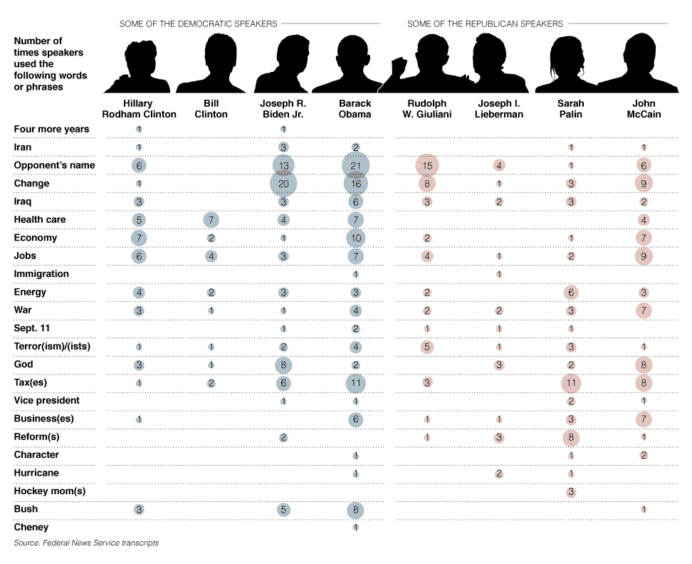
Source: Campaign language by speaker, Matthew Ericson, New York Times
This table shows who said each frequently spoken word. What information could I get from this graphic that might help me answer a research question? What if I wanted to know the answer to this question: “Was the Democrats’ victory due to negative campaigning against the Republicans?” What data might help me figure that out? Well, Barak Obama and Joe Biden spoke their opponent’s name frequently, and they also spoke of former president Bush frequently as well. This doesn’t tell us whether the mentions were negative, but it does tell us that we might want to look at video clips and transcripts of speeches by Obama and Biden to learn more about their mentions of John McCain and George Bush.
Let’s look at another table and answer a few questions about the data it illustrates. Suppose you are getting ready to apply to colleges and you want to know which majors have the highest earning potential. This table from Vanderbilt University shows entry-level and mid-career earnings by major.
|
Undergraduate Major |
Starting Median Salary |
Mid-Career Median Salary |
Ratio of Starting to Mid-Career Salary |
|---|---|---|---|
|
Accounting |
$46,000.00 |
$77,100.00 |
1.68 |
|
Business Management |
$43,000.00 |
$72,100.00 |
1.68 |
|
Economics |
$50,000.00 |
$98,600.00 |
1.97 |
|
Finance |
$47,900.00 |
$88,300.00 |
1.84 |
|
History |
$39,200.00 |
$71,000.00 |
1.81 |
|
Industrial Engineering |
$57,000.00 |
$94,700.00 |
1.64 |
|
Information Technology (IT) |
$49,100.00 |
$74,800.00 |
1.52 |
|
International Relations |
$40,900.00 |
$80,900.00 |
1.98 |
|
Management Informations Systems (MIS) |
$49,200.00 |
$82,300.00 |
1.67 |
|
Marketing |
$40,800.00 |
$79,600.00 |
1.95 |
|
Math |
$45,400.00 |
$92,400.00 |
2.04 |
|
Mechanical Engineering |
$57,900.00 |
$93,600.00 |
1.62 |
|
Political Science |
$40,800.00 |
$78,200.00 |
1.92 |
|
Psychology |
$35,900.00 |
$60,400.00 |
1.68 |
|
Sociology |
$36,500.00 |
$58,200.00 |
1.59 |
Using your notes, answer the questions below. Check your understanding when you are finished.
- Which major earns more than twice its entry-level salary by mid-career?
- Which major has the lowest entry-level salary?
- Which major has the lowest percent change, or ratio, between entry-level and mid-career salaries?
- Math
- Psychology
- Information Technology
How could you use this information? If you’re strictly motivated by earning potential, you could start researching colleges with the best math departments. If you’re determined to become a sociology major even though the earning potential is at the very bottom of the graph, you might want to research colleges with the best scholarships or cheapest tuition so that you won’t be mired in debt when you graduate, since your earning potential and ability to pay back loans won’t be as high. We might also want to research whether these mid-career salaries are affected when workers go back to school and attain graduate degrees.
In the next section, you’ll look at charts and graphs that provide more information than a graphic and are more like a picture than a table.